
TROYAK EXECUTIVE TEAM is informing all members, colleagues, collectors, and Polonia at large, that Club meetings taking place at John Paul II Polish Cultural Centre, 4300 Cawthra Rd. (just south of Hwy. 403), Mississauga, Ontario. The new members are always welcome. www.polishculturalcentre.ca
ADRES SPOTKAÑ KLUBOWYCH ! Zarząd Główny Klubu “Troyak” informuje wszystkich członków kolekcjonerów, sympatyków oraz całą Polonię, że spotkania klubowe odbywają się w Polskim Centrum Kultury im. Jana Pawła II, przy 4300 Cawthra Rd. (na południe od autostrady 403), Mississauga, Ontario. Zapraszamy nowych członków do prężnego. Klubu “Troyak”. www.polishculturalcentre.ca

“TROYAK” CLUB NEXT MEETINGS …
NASTĘPNE SPOTKANIA KLUBU “TROYAK” …

July & August 2026 –
Summer break … Letnie wakacje …
TROYAK CLUB @
Roncesvalles Polish Festival 2026
Saturday, September 12th
Sunday, September 13th, 2026
https://polishfestival.ca www.kazimierz.org

St. Casimir’s Church Parish Hall …
156 Roncesvalles Ave. Toronto, Ontario
Displays of Coins, Stamps, Collectibles
by Troyak Club Members.
Roncesvalles Polish Festival
www.troyakclub.com

27th September 2026
25th October 2026
29th November 2026
December 2026 … Happy Holidays!
100-lecie Gdyni …
www.poczta-polska.pl
07-05-2026 … Nominał znaczka: beznominałowy … Autor projektu: Agnieszka Sancewicz; Ilość znaczków w emisji: 1; Format znaczka: 31,25 x 43 mm; Technika druku / Papier: Offset / fluorescencyjny; Nakład: 76 000 szt.; Ilość znaczków w arkuszu: 8; Format koperty FDC: 162 mm x 113 mm.
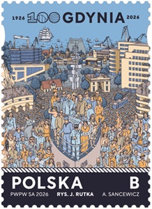
Data emisji: 07-05-2026 … Emisja filatelistyczna „100‑lecie Gdyni” została przygotowana z okazji jubileuszu miasta i powstała w ścisłej współpracy z Urzędem Miasta Gdyni. Projekty znaczków, arkusika oraz koperty FDC tworzą spójną oprawę graficzną jubileuszu, łącząc nowoczesną identyfikację wizualną z historycznym dziedzictwem dynamicznie rozwijającego się miasta portowego. Motyw przewodni emisji oparto na plakacie jubileuszowym Gdyni, który w syntetyczny i symboliczny sposób ukazuje drogę miasta – od wspólnej budowy nowoczesnego portu po ukształtowanie się jednego z najważniejszych ośrodków morskich Polski i Europy.
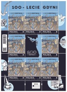
Na znaczku przedstawiono grafikę plakatu jubileuszowego miasta Gdyni. Ilustracja ukazuje zatłoczoną, wielowątkową scenę miejską, w której przenikają się elementy architektury, infrastruktury portowej oraz postacie symbolizujące mieszkańców i budowniczych miasta. Kompozycja oddaje energię rozwoju, wspólnotowość oraz morski charakter Gdyni. Przywieszka stanowi integralny element kompozycji i wzmacnia przekaz jubileuszowy, eksponując znak graficzny 100‑lecia Gdyni w zestawieniu z mapowym zarysem miasta. Całość podkreśla tożsamość Gdyni jako miasta otwartego na morze i świat. Arkusik zawiera 8 znaczków pocztowych oraz przywieszkę, pełniąc jednocześnie funkcję narracyjną i symboliczną. Układ arkusika porządkują dodatkowe elementy graficzne: motywy morskie i portowe (kotwica, fale, statki), obrys miasta Gdyni, ilustracyjne detale nawiązujące do historii portu, transportu i architektury modernistycznej.
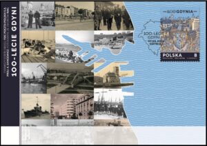
Grafikę koperty FDC oparto na archiwalnych fotografiach ze zbiorów Narodowego Archiwum Cyfrowego, dokumentujących kluczowe etapy budowy i rozwoju Gdyni – od początków portu, poprzez rozwój infrastruktury miejskiej, aż po okres dynamicznej rozbudowy przedwojennej. Fotografie zestawiono z nowoczesną, jasnoniebieską oprawą graficzną oraz falującym tłem nawiązującym do Bałtyku i morskiego charakteru miasta. Centralnym elementem koperty jest obrys Gdyni wkomponowany w kompozycję zdjęć, tworzący wizualny dialog między przeszłością a współczesnością. Datownik pierwszego dnia obiegu został zaprojektowany na bazie obrysu miasta Gdyni, uzupełnionego nazwą emisji i datą obiegu. Prosta, nowoczesna forma datownika harmonijnie uzupełnia całość oprawy jubileuszowej. Oznaczenie literowe B odpowiada wartości nominalnej znaczka używanego do uiszczenia opłaty za priorytetową przesyłkę listową nierejestrowaną w obrocie krajowym w formacie S.

100th Anniversary of Gdynia …
www.poczta-polska.pl
07-05-2026 … Denomination: stamps without face value … Author of the stamp design: Agnieszka Sancewicz; Number of stamps in issue: 1; Stamp size: 31,25 x 43 mm; Paper: Fluorescent; Printing techniques: Offset; Sales sheet: 8; Print run: 76 000 pcs; FDC size: 162 mm x 113 mm.
Issue date: 07-05-2026 … The philatelic issue “100th Anniversary of Gdynia” was prepared to celebrate the city’s centenary and created in close cooperation with the Gdynia City Hall. The stamp, sheet and First Day Cover form a coherent jubilee graphic concept, combining contemporary visual identity with the historical heritage of a dynamically developing port city.
The central motif of the issue is based on Gdynia’s jubilee poster, which presents, in a synthetic and symbolic way, the city’s transformation – from a settlement built through collective effort into a modern maritime hub. The stamp features the jubilee poster graphic of the City of Gdynia. The illustration depicts a dense, multi‑layered urban scene in which architecture, port infrastructure and figures symbolizing the city’s builders and residents come together. The composition reflects the energy of development, civic unity and the maritime identity of Gdynia.
The sheet consists of eight postage stamps and a label, fulfilling both a narrative and symbolic role. The composition is organized by additional graphic elements referencing: maritime and port symbolism (anchor, waves, ships), the outline of the city of Gdynia, illustrative details related to port development, transport and modernist architecture. The label is an integral part of the design and strengthens the jubilee message by showcasing the 100th anniversary logo alongside the city’s outline. The entire sheet emphasizes Gdynia’s identity as a city open to the sea and the world.
The graphic design of the FDC is based on archival photographs from the National Digital Archives, documenting key stages in the construction and development of Gdynia – from the early formation of the port, through urban growth, to the dynamic expansion of the interwar period. The photographs are combined with a modern light‑blue graphic setting and a wave‑patterned background evoking the Baltic Sea and the city’s maritime character. The outline of Gdynia, integrated into the photographic collage, creates a visual dialogue between past and present. The postmark design is based on the outline of the city of Gdynia, complemented by the name of the issue and the first day of circulation. Its minimalist, contemporary form completes the jubilee visual identity.
Andrzej Wajda …
www.poczta-polska.pl
22-05-2026 … Nominał znaczka: beznominałowy … Autor projektu: Andrzej Pągowski; Ilość znaczków w emisji: 1; Format znaczka: 40,5 x 40,5 mm; Technika druku / Papier: Offset / fluorescencyjny; Nakład: 72 000 szt.; Ilość znaczków w arkuszu: 6; Format koperty FDC: 162 mm x 113 mm.
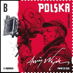
Data emisji: 22-05-2026 … Emisja filatelistyczna poświęcona Andrzejowi Wajdzie należy do najważniejszych projektów upamiętniających wybitne postaci polskiej kultury. Ukazuje jednego z najwybitniejszych reżyserów światowego kina, twórcę o ogromnym wpływie na rozwój polskiej i europejskiej sztuki filmowej.Projekt powstał przy współpracy i konsultacjach merytorycznych z: prof. Krystyną Zachwatowicz‑Wajdą, Fundacją Kyoto‑Kraków, Stowarzyszeniem Filmowców Polskich, a także przy wsparciu instytucji państwowych – Sejmu i Senatu RP.
Na znaczku przedstawiono artystyczną grafikę wizerunku Andrzeja Wajdy z kamerą filmową, opracowaną na podstawie fotografii z 1974 roku autorstwa Andrzeja Zbranieckiego (PAP), wykonanej podczas realizacji filmu „Ziemia obiecana”. Kompozycja utrzymana jest w kontrastowej, czerwono‑czarnej stylistyce, która podkreśla: ***ekspresję twórczą reżysera, ***dynamikę pracy na planie filmowym, ***charakterystyczny język wizualny kina Wajdy.
Arkusik zawiera 6 znaczków (układ 3 × 2) oraz rozbudowaną oprawę graficzną, tworzącą spójną narrację wokół postaci reżysera. Dodatkowe elementy arkusika obejmują: ***podpis „Wajda” umieszczony w górnej części, ***typograficzne powtórzenie nazwiska ANDRZEJ WAJDA, ***minimalistyczne, jasne tło kontrastujące z intensywną czerwienią znaczków, ***elementy instytucjonalne (Sejm RP, Stowarzyszenie Filmowców Polskich).

Kompozycja arkusika oddaje połączenie sztuki filmowej z oficjalnym uhonorowaniem twórcy, nadając całości charakter prestiżowy i kolekcjonerski. Projekt koperty FDC przedstawia artystyczne zdjęcie Andrzeja Wajdy autorstwa Edwarda Hartwiga ze zbiorów Narodowego Archiwum Cyfrowego. Fotografia ma charakter portretowy i utrzymana jest w klasycznej, eleganckiej stylistyce, podkreślającej: ***rangę twórcy, ***jego dorobek artystyczny, ***ponadczasowy charakter jego pracy.
Datownik zawiera faksymile podpisu Andrzeja Wajdy, co stanowi osobisty i symboliczny element całej emisji, podkreślający indywidualny wkład reżysera w kulturę. Jego twórczość była wielokrotnie nominowana do Oscara oraz nagradzana na najważniejszych festiwalach filmowych świata. Emisja „Andrzej Wajda” to nie tylko hołd dla wybitnego reżysera, ale również przypomnienie o roli kina jako nośnika pamięci, historii i tożsamości kulturowej. To kolekcjonerski walor, który łączy filatelistykę ze sztuką filmową, oddając hołd jednemu z najważniejszych twórców w historii światowego kina. Oznaczenie literowe B odpowiada wartości nominalnej znaczka używanego do uiszczenia opłaty za priorytetową przesyłkę listową nierejestrowaną w obrocie krajowym w formacie S.
Andrzej Wajda – stamp – 2026
www.poczta-polska.pl
22-05-2026 … Denomination: stamps without face value … Author of the stamp design: Andrzej Pągowski; Number of stamps in issue: 1; Stamp size: 40,5 x 40,5 mm; Paper: Fluorescent; Printing techniques: Offset; Sales sheet: 6; Print run: 72 000 pcs; FDC size: 162 mm x 113 mm.
Issue date: 22-05-2026 … The philatelic issue dedicated to Andrzej Wajda honors one of the most outstanding figures of world cinema and a director who profoundly shaped Polish and European film culture. The project was developed in cooperation with and with expert consultation from: Prof. Krystyna Zachwatowicz‑Wajda, the Kyoto‑Kraków Foundation of Andrzej Wajda and Krystyna Zachwatowicz‑Wajda, the Polish Filmmakers Association, as well as the Polish Parliament (Sejm and Senate).
The stamp features an artistic portrait of Andrzej Wajda with a film camera, based on a photograph taken in 1974 by Andrzej Zbraniecki (PAP) during the shooting of the film “The Promised Land”. The bold red‑and‑black composition emphasizes: ***creative expression, ***cinematic dynamism, ***the director’s distinctive artistic style.
The sheet contains 6 stamps (3×2 layout) with an extended graphic setting. Additional design elements include: ***the signature “Wajda”, ***typographic repetition of the name ANDRZEJ WAJDA, ***minimalist background contrasting with the intense red stamps, ***institutional references enhancing the commemorative character. The FDC features an artistic photograph by Edward Hartwig, sourced from the National Digital Archives. The portrait highlights the director’s significance and timeless legacy in cinema.The postmark uses a facsimile of Andrzej Wajda’s signature, adding a personal and symbolic element to the issue.
Odkryj Polskę –
Zespół pałacowo-parkowy w Kozłówce
www.nbp.pl
Narodowy Bank Polski jest centralnym bankiem państwa odpowiadającym za politykę pieniężną i stabilność cen. Jego funkcje określa Konstytucja Rzeczypospolitej Polskiej i ustawa o NBP. NBP ma wyłączne prawo emisji pieniądza. Jako bank centralny nie prowadzi rachunków bankowych obywateli, nie przyjmuje od nich lokat, nie udziela kredytów. Prowadzi natomiast obsługę budżetu państwa, a także podmiotów sektora finansów publicznych. Gromadzi rezerwy walutowe państwa i zarządza nimi. Pełni funkcję banku banków, tworząc warunki do działania systemu bankowego. Jest również jednym z najważniejszych ośrodków naukowo-analitycznych w dziedzinie ekonomii i rynków finansowych.
Emisja wartości kolekcjonerskich stanowi okazję do upamiętniania ważnych historycznych rocznic i postaci oraz do rozwijania zainteresowań polską kulturą, nauką i tradycją. 22 maja 2026 roku Narodowy Bank Polski wprowadził do obiegu monetę okolicznościową o nominale 5 zł z serii „Odkryj Polskę” – „Zespół pałacowo-parkowy w Kozłówce”.
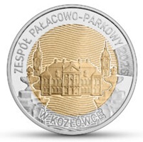
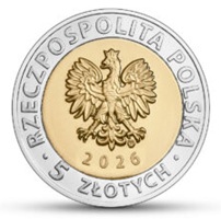
Nominał: 5 zł … stop: pierścień MN25, rdzeń CuAl6Ni2; stempel: zwykły; średnica: 24,00 mm; masa: 6,54 g; brzeg (bok): moletowany nieregularnie; na boku ośmiokrotnie powtórzony napis: NBP, co drugi odwrócony o 180 stopni, rozdzielony gwiazdkami; nakład: do 1 000 000 szt.; Projekt: Dobrochna Surajewska; Emitent: NBP; Na zlecenie NBP monety wyprodukowała Mennica Polska SA. Na rewersie monety przedstawiono widok przez zwieńczenie bramy głównej zespołu na dziedziniec i frontową elewację pałacu z wieżami.
Zespół pałacowo-parkowy w Kozłówce, nazywany perłą Lubelszczyzny, jest jedną z najlepiej utrzymanych dawnych posiadłości arystokratycznych w Polsce. Kompleks o powierzchni 21,7 hektara, wzniesiony w drugiej ćwierci XVIII w. jako letnia rezydencja Michała Bielińskiego, zachowuje zasadniczy układ późnobarokowego założenia „między dziedzińcem a ogrodem”. W takim kształcie został zakupiony przez Aleksandra Zamoyskiego w 1799 r. Obecny wygląd charakteryzują nawarstwienia stylów architektonicznych z okresu rozbudowy przeprowadzonej na przełomie XIX i XX stulecia przez Konstantego Zamoyskiego. W 1903 r. wokół swojej stałej rodowej siedziby hrabia utworzył ordynację liczącą ponad 7600 hektarów. Majątek pozostawał własnością Zamoyskich do 1944 r., kiedy został upaństwowiony i przekazany do użytkowania różnym instytucjom. Powstała wtedy m.in. działająca do dziś placówka muzealna, od 1992 r. funkcjonująca pod nazwą Muzeum Zamoyskich w Kozłówce. W 2007 r. obiekt otrzymał honorowy tytuł Pomnika Historii.
Zespół pałacowy obejmuje kilkanaście zabytkowych budynków, w większości symetrycznie rozmieszczonych parami wokół prostokątnego dziedzińca. Bryły narastają stopniowo i rytmicznie od neobarokowej bramy głównej. Za nią znajdują się parterowe pawilony (dawna stajnia z urządzoną wystawą pojazdów konnych oraz wozownia z Galerią Sztuki prezentującą twórczość powojenną), kordegardy (pełniące dziś funkcje administracyjne), oficyny boczne (z szeroką ofertą kulturalną i turystyczną), a następnie narożne budynki tzw. teatralni oraz kaplicy wzorowanej na kaplicy królewskiej w Wersalu. Kulminacją jest centralnie usytuowany pałac z reprezentacyjnym portykiem i górującymi wieżami, nadającymi monumentalny charakter całemu założeniu. Wyjątkową atrakcją są wnętrza z zachowanym oryginalnym wystrojem architektonicznym z przełomu XIX i XX w. oraz ocalałą częścią rodzinnej kolekcji Zamoyskich, uzupełnianej nabytkami muzealnymi. Tworzą one bogate zbiory malarstwa, rzeźby, rzemiosła artystycznego i kultury materialnej, oddające atmosferę arystokratycznego życia.
Poza dziedzińcem znajduje się m.in. dawna stajnia koni remontowych z udostępnioną obecnie ekspozycją „Socrealizm. Galeria Sztuki”. W parku, po rekonstrukcji barokowego założenia ogrodowego z XVIII w., centralną część zajmuje regularny ogród francuski otoczony rzędem lip. W tę scenerię są wkomponowane elementy małej architektury: XIX-wieczna fontanna z rzeźbioną grupą trzech igrających puttów oraz pomnik z kamienia polnego kryjący prochy żołnierzy napoleońskich zmarłych w kampanii 1812 r., wystawiony w 1930 r. przez Zamoyskich. Ze skromnym charakterem tego obiektu koresponduje oznaczony prostym brzozowym krzyżem grób ziemny Adama Zamoyskiego, II ordynata kozłowieckiego, i jego żony Marii, znajdujący się obok kaplicy pałacowej. Od południa, na terenie dawnego ogrodu włoskiego, zachował się szpaler grabowy z XIX w. Drzewostan parku w Kozłówce stanowią przede wszystkim lipy i klony z domieszką kasztanowców, grabów, sosen, świerków, topoli i brzóz oraz dorodnych wiązów. Występują również dęby – wśród nich szlachetne okazy będące pomnikami przyrody. Informacja: Karolina Wilkowicz, Muzeum Zamoyskich w Kozłówce.
Discover Poland –
The Palace and Park Complex in Kozłówka
www.nbp.pl
Narodowy Bank Polski is the central bank of the State, responsible for its monetary policy and price stability. The Bank’s functions are described in the Constitution of the Republic of Poland and the Act on NBP. NBP holds the exclusive right to issue the currency of the Republic of Poland. As the central bank, it does not provide accounts for the general public, accept deposits from or extend loans to individuals. It acts as a banker to the State budget and public sector entities. NBP also holds and manages the foreign exchange reserves of the State. Finally, it functions as a banker to banks, creating conditions for the operation of the Polish banking system. Narodowy Bank Polski is one of the most important research and analytical centres in the fields of economics and financial markets.
Issuing collector items is an occasion to commemorate important historic figures and anniversaries, as well as to develop the interest of the public in Polish culture, science and tradition. On 22 May 2026, Narodowy Bank Polski issued into circulation a collector coin of the series “Discover Poland” – “The Palace and Park Complex in Kozłówka”, with a face value of 5 złoty.
Face value: 5 zł … Alloy: ring MN25, core CuAl6Ni2; Finish: standard; Diameter: 24.00 mm; Weight: 6.54 g; Edge (side): irregularly milled, with the inscription “NBP”, repeated eight times, every second one inverted by 180 degrees, separated by stars; Mintage: up to 1,000,000 pcs; Design: Dobrochna Surajewska; Issuer: Narodowy Bank Polski ; The coins, commissioned by Narodowy Bank Polski, were struck by Mennica Polska SA. The reverse of the coin depicts a view through the cresting of the complex’s main gate to the courtyard and the front façade of the palace with its towers.
The palace and park complex in Kozłówka, often referred to as a true gem of the lubelskie region, is one of the best preserved former aristocratic estates in Poland. The complex which takes up 21.7 ha and was constructed ca 1740 as a summer residence for Michał Bieliński retains the fundamental Late Baroque “entre cour et jardin” (between courtyard and garden) layout. In this form, it was bought by Aleksander Zamoyski in 1799. Its present appearance reflects subsequent layering of architectural styles from the reconstruction realised in the late 19th and early 20th century by Konstanty Zamoyski. In 1903 the count founded an ordinance around his family seat, covering over 7,600 ha. The estate was owned by the Zamoyski family until 1944 when it was taken over by the State and transferred for use by various official bodies.
One of the facilities created at that time is the museum, which changed its name in 1992 and now functions as the Zamoyski Museum in Kozłówka. In 2007 the estate was acknowledged as a Historic Monument. The palace complex includes over ten buildings, most of which are symmetrically laid out in twos around a rectangular courtyard. The architectural structures expand gradually and rhythmically from the Neo-Baroque main gate. Situated behind the gate are one-storey pavilions (former stables housing an exhibition of horse-drawn vehicles and a carriage house-turned-art gallery presenting post-war era art), guardhouses now used for administrative purposes, side outbuildings with a wide range of cultural and tourist offerings and, finally, the corner buildings of the private theatre and the chapel – designed after the Royal Chapel of Versailles. The structure comes together in the centrally located palace with a grand portico and high towers, lending the complex a monumental air. The interiors remain an exceptional highlight with their well-preserved architectural design from the late 19th and early 20th century and the remaining part of the Zamoyski family collection, supplemented by subsequent museum acquisitions.
They form a rich collection of paintings, sculpture, artistic craftmanship and cultural heritage reflecting the spirit of aristocratic life. Beyond the courtyard lay the former remount stables now housing the “Social realism. Art Gallery” exhibition. The park, following a reconstruction of the 18th century Baroque arrangement, is centred around a formal French garden bordered with a line of lindens. The scenery incorporates small architectural structures: 19th century fountain with a sculpture of three frolicking putti and a fieldstone monument holding the ashes of the Napoleon’s soldiers fallen in the 1812 campaign, erected in 1930 by the Zamoyski family. The monument’s humble character is mirrored in the earthen grave of Adam Zamoyski – the 2nd entailer of Kozłówka, and his wife Maria, decorated with a simple birch cross and located near the palace chapel. To the south, in the location of the former Italian garden, a 19th century hornbeam alley has been preserved. The park’s tree stand consists mainly of lindens and maples, with some chestnut trees, hornbeams, pines, spruces, poplars and sturdy elms. There are also some oaks – including noble specimens acknowledged as natural monuments. Info: Karolina Wilkowicz, The Zamoyski Museum in Kozłówka.
Places of Pride (2026)
www.canadapost.ca
Places of Pride celebrates the spaces and places across the country that in some way shaped the present and can inspire the future. It highlights the resilience, courage and achievements of 2SLGBTQIA+ communities that have contributed to Canada’s ongoing journey toward inclusivity and equality. Each booklet of 8 Permanent™ domestic rate stamps in the Places of Pride (2026) stamp issue includes two of each of the four designs in the set. Official First Day Covers for each design in the issue are also available. These products are sold separately.
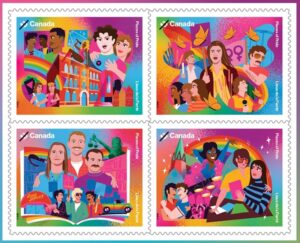
About the issue … Places of Pride takes us to sites across Canada that 2SLGBTQIA+ people fought to make their own: places of celebration and freedom to be fully oneself, and spaces that nurtured a sense of solidarity that became a catalyst for change. The 519, the first City of Toronto community centre run by and for the 2SLGBTQIA+ community. Metamorphosis, a festival in Saskatoon considered to be the first celebration of queer culture in Western Canada. Vancouver’s Little Sister’s Book & Art Emporium, which fought a landmark case to protect 2SLGBTQIA+ rights in the Canadian Charter of Rights and Freedoms. The Turret, a Halifax hub for social, political and cultural life from 1976 to 1982.
About the design … This issue, designed by Kelly Small at Intents & Purposes Inc. and illustrated by Tim Singleton, captures four landmark locations in rich colour illustration. Each stamp captures a moment that played a role in advancing 2SLGBTQIA+ rights or recognition. Quantity Produced: 100,000. Issue Date June 5, 2026. Places of Pride celebrates the spaces and places across the country that in some way shaped the present and can inspire the future. It highlights the resilience, courage and achievements of 2SLGBTQIA+ communities that have contributed to Canada’s ongoing journey toward inclusivity and equality.
About The Turret … Founded by the Gay Alliance for Equality (GAE) in response to hate and discrimination in non-gay social spaces, The Turret emerged as a safe and inclusive place for queer people to be themselves. Located on the third floor of 1588 Barrington Street, the venue was named after the building’s spire-tipped tower and began as a one-night-only gay disco in 1976. It quickly became one of Halifax’s first gay bars, hosting discos, variety and drag shows and folk nights – and fostering connection and belonging. A centre for activism, The Turret also provided space for meetings, workshops and conferences, including the 1977 Atlantic Gay Conference. The building also housed The Alternate Book Shop – the first gay bookstore in Atlantic Canada – further solidifying its importance to community members from across the region. Though it closed in 1982, The Turret remains a powerful symbol of community, progress and belonging.
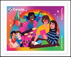
About the design … This issue, designed by Kelly Small at Intents & Purposes Inc. and illustrated by Tim Singleton, captures four landmark locations in rich colour illustration. The cancel mark depicts the building’s iconic and most recognizable feature, the spire-tipped tower. Cancellation Site: Halifax, Nova Scotia; Stamp Designer: Kelly Small | Intents & Purposes Inc.; Stamp Illustrator: Tim Singleton; Quantity Produced: 7,000; Issue Date: June 5, 2026.
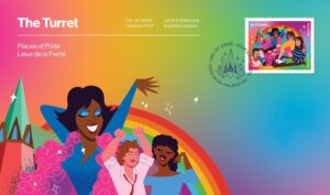
Places of Pride (2026): Official First Day Cover – The Turret … Places of Pride celebrates the spaces and places across the country that in some way shaped the present and can inspire the future. It highlights the resilience, courage and achievements of 2SLGBTQIA+ communities that have contributed to Canada’s ongoing journey toward inclusivity and equality. The Turret Official First Day Cover is cancelled in Halifax, Nova Scotia. The 2026 Places of Pride stamp issue also includes a booklet of 8 Permanent™ domestic rate stamps, including two of each of the four designs in the set. This product is sold separately. Official First Day Covers for each design in the issue are also available. These products are sold separately. Places of Pride takes us to sites across Canada that 2SLGBTQIA+ people fought to make their own – places of celebration and freedom such as The Turret, a Halifax hub for social, political and cultural life from 1976 to 1982.
About The 519 … Located in the Church-Wellesley Village, the historic home of Toronto’s queer community, The 519 has provided vital support and a safe space to many 2SLGBTQIA+ communities. The 519 began working with the community by hosting a gay youth group organized by Huntley Youth Services in 1976. Over the decades, The 519 became a hub for numerous advocacy groups, including the Right to Privacy Committee, formed after a 1978 bathhouse raid, and organizations such as Zami, a support group for 2SLGBTQIA+ Black and West Indian communities founded in 1984. The 519 has also launched such ongoing initiatives as Meal Trans, in 1997 – its first multi-service program for low income and street active transgender people – and Among Friends, in 2005, a program for 2SLGBTQIA+ refugee claimants and asylum seekers. As one of Canada’s largest 2SLGBTQIA+ organizations, The 519 plays an important role in fostering belonging, activism and acceptance.
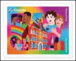
About the design … This issue, designed by Kelly Small at Intents & Purposes Inc. and illustrated by Tim Singleton, captures four landmark locations in rich colour illustration. The cancel mark depicts a protest placard, in honour of the community organizing hosted at The 519. Cancellation Site Toronto, Ontario. Quantity Produced: 7,000. Issue Date June 5, 2026.
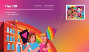
Places of Pride (2026): Official First Day Cover – The 519 … Places of Pride takes celebrates the spaces and places across the country that in some way shaped the present and can inspire the future. It highlights the resilience, courage and achievements of 2SLGBTQIA+ communities that have contributed to Canada’s ongoing journey toward inclusivity and equality. The 519 Official First Day Cover is cancelled in Toronto, Ontario. The 2026 Places of Pride stamp issue also includes a booklet of 8 Permanent™ domestic rate stamps, including two of each of the four designs in the set. This product is sold separately. Official First Day Covers for each design in the issue are also available. These products are sold separately. Places of Pride takes us to sites across Canada that 2SLGBTQIA+ people fought to make their own – places of celebration and freedom such as The 519, the first City of Toronto community centre run by and for the 2SLGBTQIA+ community.
About Metamorphosis … First held in 1978, Metamorphosis, a festival in Saskatoon, became a vital space for queer celebration, unity and political advocacy. Organized by activists, including the Saskatchewan Gay Coalition, the inaugural festival brought together over 200 people for four days of art and culture, with performances by artists like Ferron, Blackberri and Michael Gordon. Held over the Thanksgiving weekend, the festival demonstrated the importance of chosen family for those feeling isolated during the holiday. After a march and rally at City Hall, Metamorphosis made national headlines and inspired queer activism across Canada. Over time, the annual event became especially significant for the lesbian community, offering both cultural expression and community support. It also featured workshops on sexuality, health and legal rights. Held annually until 1989, the festival remains a landmark in Prairie queer history and played a vital role in advancing 2SLGBTQIA+ visibility on a national scale.
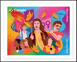
About the design … This issue, designed by Kelly Small at Intents & Purposes Inc. and illustrated by Tim Singleton, captures four landmark locations in rich colour illustration. The cancel mark depicts a butterfly motif, adopted as a symbol for the festival and represents the community’s transformative journey. Cancellation Site: Saskatoon, Saskatchewan; Stamp Designer: Kelly Small | Intents & Purposes Inc.; Stamp Illustrator: Tim Singleton; Quantity Produced: 7,000; Issue Date: June 5, 2026.
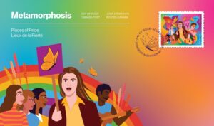
The Metamorphosis Official First Day Cover is cancelled in Saskatoon, Saskatchewan. The 2026 Places of Pride stamp issue also includes a booklet of 8 Permanent™ domestic rate stamps, including two of each of the four designs in the set. This product is sold separately. Official First Day Covers for each design in the issue are also available. These products are sold separately. Places of Pride takes us to sites across Canada that 2SLGBTQIA+ people fought to make their own – places of celebration and freedom such as the Metamorphosis festival, said to be the first celebration of queer culture in Western Canada.
About Little Sister’s Book & Art Emporium … Little Sister’s Book & Art Emporium was founded in 1983 by partners Bruce Smyth and Jim Deva, and friend Barb Thomas to serve the local queer community. It was managed for many years by Janine Fuller. Challenges arose when Canada Customs targeted and seized imported materials deemed obscene. These included publications on queer sexual health, relationships and identities – topics vital to the community’s safety and well-being. As seizures continued, the owners held a protest rally on December 17, 1986, drawing media attention and the support of the BC Civil Liberties Association. This led to a year-long legal battle against censorship by Canada Customs in 1987. In 2000, the Supreme Court of Canada determined that Canada Customs had violated the store’s Charter rights to equality and freedom of expression. Little Sister’s remains a welcoming sanctuary, a symbol of pride and a testament to the strength and resilience of the 2SLGBTQIA+ community.
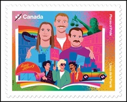
About the design … This issue, designed by Kelly Small at Intents & Purposes Inc. and illustrated by Tim Singleton, captures four landmark locations in rich colour illustration. The cancel mark depicts a book, representing Little Sister’s Book & Art Emporium as a hub for literature, art and community expression. Cancellation Site Vancouver, British Columbia; Quantity Produced: 7,000. Issue Date June 5, 2026.

Places of Pride (2026): Official First Day Cover – Little Sister’s Book & Art Emporium … Places of Pride celebrates the spaces and places across the country that in some way shaped the present and can inspire the future. It highlights the resilience, courage and achievements of 2SLGBTQIA+ communities that have contributed to Canada’s ongoing journey toward inclusivity and equality. The Little Sister’s Book & Art Emporium Official First Day Cover is cancelled in Vancouver, British Columbia. The 2026 Places of Pride stamp issue also includes a booklet of 8 Permanent™ domestic rate stamps, including two of each of the four designs in the set. This product is sold separately. Official First Day Covers for each design in the issue are also available. These products are sold separately. Places of Pride takes us to sites across Canada that 2SLGBTQIA+ people fought to make their own – places of celebration and freedom such as Vancouver’s Little Sister’s Book & Art Emporium, which fought a landmark case to protect 2SLGBTQIA+ rights in the Canadian Charter of Rights and Freedoms.
2026 … Canada Lucky Loonie in Keychain
www.mint.ca
Celebrate the essence of Canada with the Lucky Dollar – a special keepsake that embodies the heart and soul of the nation! The Canadian Lucky Dollar tradition recognizes the achievements and dedication of Canadian athletes who inspire the entire country. Whether given as a pre-game gift or kept as a hidden talisman, it’s a fun way for parents and coaches to encourage the next generation of athletes to dream big, believe in themselves, and strive for excellence. Beyond sports, the Lucky Dollar speaks to our patriotic spirit; it’s presented here as a keychain so you can show your Canadian pride and always keep a piece of Canada close at hand!
Support our athletes, aim higher, or celebrate our heritage! The lucky dollar inside this keychain symbolizes the nation’s unwavering dedication, resilience, and strength, making it the perfect souvenir for anyone who lives in this country. The famous Canadian lucky charm is back. Composition: Out of circulation item: triple plating on steel, brass finish; keychain: zinc alloy with nickel plating; Weight: 6.27 g; Slicesmooth; Finished: brilliant out of circulation; Packaging: $1; Artist: Steve Hepburn (reverse), Steven Rosati (obverse).

DID YOU KNOW?… The tradition of the lucky dollar dates back to the 2002 Winter Olympics in Salt Lake City. A one-dollar coin was buried under the ice at center ice to bring good luck to Canada’s men’s and women’s hockey teams (both of which went on to win gold medals that year). Since then, one-dollar coins have been placed under curling rinks, buried in baseball diamonds, and even stuck to basketball hoops: having become a fun good luck charm in competitions, they’ve become part of Canadian sporting culture!
Designed by Canadian artist Steve Hepburn, the 2026 Lucky Dollar continues the tradition of offering a reimagined version of the classic $1 circulation coin design by Robert-Ralph Carmichael. It depicts a quintessentially Canadian scene: a common loon ( Gavia immer ) – an emblem of Canadian wilderness and waterways – splashes in the water and triumphantly spreads its wings to form a “V” (for “victory”). The obverse features the effigy of His Majesty King Charles III, according to Canadian artist Steven Rosati.
Steven Hepburn, artist … “I found the project wonderful, as well as the story that inspired it. Who would have thought that the tradition of the lucky dollar would still be so prevalent more than 20 years later! On this 2026 version, the loon, its wings spread to form a “V,” paddles in the lake and disturbs the calm of its surface. I think this motif perfectly captures the quiet strength and resilience of the Canadian landscape. I hope it will bring a little bit of luck to anyone who wants to add some to their list.”
Clan Animals: Sandhill Crane
– $15 Fine Silver Coin
www.mint.ca
The first piece in our Clan Animals series celebrating the teachings of the Anishinabek. The Canada crane stands tall among the reeds, an elegant sentinel whose voice guides the Anishinabek. The air often stirs with its trumpeting call, which, since time immemorial, has been synonymous with gatherings and bonds between people.
The first piece in the series illustrates the elegance and authority of Ajijaak , a living emblem of direction and shared purpose. Revered as one of the principal Anishinabek clans, Ajijaak embodies wisdom and leadership, as well as the strength to reach for distant horizons. A tribute to Ajijaak , an emblem of leadership and connection.


Face Value: $15 … Composition: 99.99% pure silver; Print run:: 10,000; Weight: 23.17 g; Diameter: 36.07 mm; Edge: Sliceserrated; Finish: Finished numismatic proof; Artist: Mark V. Nadjiwan (reverse), Steven Rosati (obverse); Packaging black double-shell case with matching black protective box.
DID YOU KNOW? … For the Anishinabek, Ajijaak (the Crane) is an important clan leader, renowned for his powerful cry and his role as a communicator – characteristics that inspired his sacred status and his legacy as a storyteller. This is also the clan to which the artist Mark Nadjiwan belongs, whose work reflects deep cultural roots.
The reverse design, by Anishinaabe artist Mark V. Nadjiwan, depicts a bright red sun in the morning sky, with another touch of red on the top of the sandhill crane’s head. Ajijaak (the Crane) stands elegantly amidst the cattails, wings outstretched as if preparing to call to the four winds. The obverse features the effigy of His Majesty King Charles III, by Canadian artist Steven Rosati.
Mark V. Nadjiwan, artist and member of the Crane Clan … “Ajijaak (the Crane) is one of the principal doodem (clan) chiefs of the Anishinabek. The chiefs of this clan are responsible for communicating with people outside their communities. Some believe that Ajijaak’s role was assigned to them by the Creator because of the power of his call. According to legend, long ago, Ajijaak was tasked with summoning all beings to a great gathering. To do this, he filled the sky with his iconic call, which could be heard by everyone, wherever they were. The coin’s design depicts the sandhill crane, the most common crane species in the Great Lakes region, particularly on the territory of the Saugeen Ojibway Nation, where it is found in large numbers. Its unmistakable call can frequently be heard for miles around.”
Alicia Cook Sapene, product manager … “It is an honor to have collaborated with artist Mark Nadjiwan on the Clan Animals series. I was deeply moved by the meaning behind each clan animal, and captivated by Mark’s precise and powerful style. Our team has strived to preserve his vision, enhancing each piece with textures etched beneath the paint to take the narrative to another level. This series celebrates the lessons these animals teach us, and we hope these messages will resonate with numismatists and be passed down from generation to generation.”
Clan Animals: Bear
– $15 Fine Silver Coin
www.mint.ca
A tribute to Mukwa – protector, healer, guardian. On the second piece in the Clan Animals series , Mukwa (the Bear) provides a stoic presence among the Anishinabek, embodying benevolence, peacemaking, and the knowledge needed to restore balance. In close symbiosis with the rhythms of the earth and the cycle of the seasons, Mukwa is seen as a guardian and guide—a being who teaches and protects people while ensuring their well-being. This 3/4 oz coin in 99.99% pure silver evokes the quiet strength and determination of Mukwa , the protector whose strength and restorative wisdom help to protect the community. Second piece in theClan Animalsseries .

Face Value: $15 … Composition: 99.99% pure silver; Print run:: 10,000; Weight: 23.17 g; Diameter: 36.07 mm; Edge: Sliceserrated; Finish: Finished numismatic proof; Artist: Mark V. Nadjiwan (reverse), Steven Rosati (obverse); Packaging black double-shell case with matching black protective box.
DID YOU KNOW? … Members of the Bear clan often play the role of protectors and peacekeepers, their strength and authority contributing to the maintenance of justice while providing support to the community.
The reverse design, by Anishinaabe artist Mark V. Nadjiwan, depicts a forest scene bathed in the red light of the midday sun, shining high in the sky. Mukwa (the Bear) walks alongside a blue stream in the forest; behind him, black spruce trees stand on one bank and a birch tree illuminates the other. The obverse features the effigy of His Majesty King Charles III, according to Canadian artist Steven Rosati.
Mark V. Nadjiwan, artist … “Mukwa Doodem (Bear Clan) is a nearly universal clan animal among the Indigenous peoples of North America, including the Anishinabek Nation. It is said that among the beings with whom we share planet Earth, Mukwa possesses the most human qualities and, in doing so, has the most to teach us about life and ourselves. Mukwa also possesses an intimate knowledge of the plant world and, therefore, of its medicinal properties; in this sense, Mukwa is also a teacher and healer for Indigenous peoples. But most importantly, Mukwa’s primary role as a clan animal is that of protector and guardian. Its strength and wisdom provide formidable protection for the safety and well-being of the Anishinabek. Today, some communities are aligning their various administrative functions with the traditional responsibilities and roles of the clans. For all these reasons, community-based policing and law enforcement services are referred to as the Bear Clan.”
Alicia Cook Sapene, product manager … “It is an honor to have collaborated with artist Mark Nadjiwan on the Clan Animals series. I was deeply moved by the meaning behind each clan animal, and captivated by Mark’s precise and powerful style. Our team has strived to preserve his vision, enhancing each piece with textures etched beneath the paint to take the narrative to another level. This series celebrates the lessons these animals teach us, and we hope these messages will resonate with numismatists and be passed down from generation to generation.”
Clan Animals: Otter
– $15 Fine Silver Coin
www.mint.ca
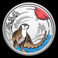
A tribute to Nigig, a symbol of healing, balance, and play. On the final piece in the Clan Animals series, Nigig the Otter embodies healing joy and sustaining balance. While Nigig ‘s grace in the water reflects his ease in navigating life’s currents, his playful spirit reminds the Anishinabek that lightness is not without strength. It is, in fact, an integral part of the healing process that restores harmony—for connection and joy possess great healing power.
Enhanced with color, this ¾ oz. 99.99% pure silver coin pays tribute to Nigig ‘s gifts : the ability to integrate play into the hard labors of life and, as a builder of connections, to keep hearts open and communities united. Third and final piece in the series.
Face Value: $15 … Composition: 99.99% pure silver; Print run:: 10,000; Weight: 23.17 g; Diameter: 36.07 mm; Edge: Sliceserrated; Finish: Finished numismatic proof; Artist: Mark V. Nadjiwan (reverse), Steven Rosati (obverse); Packaging black double-shell case with matching black protective box.
DID YOU KNOW? … Nigig is a symbol of teaching and healing. As the otter is associated with water and fluid movement, members of the otter clan are considered flexible people with a knack for problem-solving.
The reverse design, by Anishinaabe artist Mark V. Nadjiwan, depicts Nigig (the Otter) gazing at the stream bathed in the afternoon light; behind him, a curving bank dotted with windswept pines can be seen. The obverse features the effigy of His Majesty King Charles III, according to Canadian artist Steven Rosati.
Mark V. Nadjiwan, artist … “One could say that Nigig’s playful nature speaks volumes about his role as a healing animal—indeed, otter skins were used as bags for the sacred objects of the Midewiwin, the Great Medicine Society. It’s easy to understand how play provides both balance and healing, since it brings light and laughter to a world that seems to grow darker by the day. We can take this lesson from Nigig and broaden our understanding of what we can carry in our own symbolic medicine bag to heal the world and ourselves; surely, this would include tools such as traditional teachings, art, science, law, and even politics and economics. While some of these tools are not foreign to our modern problems, we have the capacity, even the responsibility, to creatively reinvent them and use them as positive agents of change.” And let us never forget the example of Nigig, who finds a balance between the heavy tasks of life and play and lightheartedness.
Alicia Cook Sapene, product manager … “It is an honor to have collaborated with artist Mark Nadjiwan on the Clan Animals series. I was deeply moved by the meaning behind each clan animal, and captivated by Mark’s precise and powerful style. Our team has strived to preserve his vision, enhancing each piece with textures etched beneath the paint to take the narrative to another level. This series celebrates the lessons these animals teach us, and we hope these messages will resonate with numismatists and be passed down from generation to generation.”
Lunar Mission
– $20 Fine Silver Coin
www.mint.ca
Destination: the Moon. Let’s celebrate the first Canadian mission around the Moon. With the launch of the Artemis II mission, Canada became the second country to send an astronaut to orbit the Moon, playing a significant role in the return of human deep space exploration and writing the next chapter of lunar exploration ! We celebrate this major scientific milestone with a 1 oz. 99.99% pure silver coin that evokes our nation’s excitement and the global wonder at the long-awaited return of lunar exploration. Indeed, more than 50 years have passed since the Apollo program!
Designed to reflect the importance of the mission in a fun and engaging way, the coin’s reverse, enhanced with selective coloring, transforms under black light. The colors revealed allow you to experience the exhilarating feeling of looking at Earth from the Moon – an absolutely spectacular view that no Canadian had ever had the chance to witness firsthand before this mission. From Earth to the Moon: the beginning of a new era of space exploration.

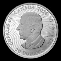
Face Value: $20 … Composition: 99.99% pure silver with color reveal; Print run:: 7,500; Weight: 31.39 g; Diameter: 38 mm; Edge: Sliceserrated; Finish: Finished numismatic proof; Artist: Pandora Young (reverse), Steven Rosati (obverse); Packaging black double-shell case with matching black protective box.
DID YOU KNOW? … ***Before the Artemis II mission, only 24 American astronauts had flown to the Moon.
***Canadian Space Agency (CSA) astronaut Jeremy Hansen is one of four crew members on Artemis II and will be the first Canadian to orbit the Moon. This nearly 10-day mission will cover more than two million kilometers, and its crew will travel thousands of kilometers beyond the Moon. It will be the first crewed test flight of the Orion spacecraft and the SLS rocket, and the first crewed lunar mission since 1972. Canada earned a place on the Artemis II mission after contributing Canadarm3 to the Gateway, a small space station near the Moon.

The reverse design, by Canadian artist Pandora Young, celebrates Canada’s participation in NASA’s Artemis II international mission. It features a portrait of a Canadian Space Agency astronaut in space with a magnified view of the Moon in the background. Selective coloring brings to life the astronaut’s orange and blue Orion spacesuit, which displays the Canadian flag on its shoulder. Under black light, the engraved Moon in the background glows, while the iconic view of Earth from space is reflected in the astronaut’s visor. The obverse features the effigy of His Majesty King Charles III, by Canadian artist Steven Rosati.
Pandora Young, artist … “For this piece, we tried different design ideas; ultimately, we chose the most appealing option. What I like about the piece is that anyone could be in the spacesuit. It encourages Canadians to imagine themselves as part of this great adventure in space. What we see instead of a person’s features is a contemplation of the beauty of our own planet reflected back to us in its full celestial splendor.”
Alicia Cook Sapene, product manager … “The design of this coin went beyond a simple motif – it was also about reflecting a historic moment of Canadian pride and space exploration. Working closely with artist Pandora Young and the Canadian Space Agency, we envisioned a tribute that would evoke for numismatists the wonder of a flight around the Moon. The coin reveals Earth as seen from space – a breathtaking sight that CSA astronaut Jeremy Hansen hopes to see for himself and deserves to be shared with the world!”
Jeremy Hansen, astronaut with the Canadian Space Agency … “Canada’s role in the Artemis II mission is a testament to bold vision and strong determination, a role we owe to courageous decisions, world-class innovations, and major contributions. I hope Canadians are proud of this mission. It reminds us that by working together, we achieve great things.”