
TROYAK EXECUTIVE TEAM is informing all members, colleagues, collectors, and Polonia at large, that Club meetings taking place at John Paul II Polish Cultural Centre, 4300 Cawthra Rd. (just south of Hwy. 403), Mississauga, Ontario. The new members are always welcome. www.polishculturalcentre.ca
ADRES SPOTKAÑ KLUBOWYCH ! Zarząd Główny Klubu “Troyak” informuje wszystkich członków kolekcjonerów, sympatyków oraz całą Polonię, że spotkania klubowe odbywają się w Polskim Centrum Kultury im. Jana Pawła II, przy 4300 Cawthra Rd. (na południe od autostrady 403), Mississauga, Ontario. Zapraszamy nowych członków do prężnego. Klubu “Troyak”. www.polishculturalcentre.ca

“TROYAK” CLUB NEXT MEETINGS …
NASTĘPNE SPOTKANIA KLUBU “TROYAK” …
Sunday – 2nd October 2022 @ 9:00 a.m. to 4:00 p.m.
Mississauga Coin & Stamp Show

30th October 2022 @ 4:30 p.m.
27th November 2022
December 2022 … Happy Holidays!
29th January 2023; 26th February 2023
26th March 2023; 30th April 2023
28th May 2023; 25th June 2023
July & August 2023 – Summer break … Letnie wakacje …
30th September 2023; 29th October 2023
26th November 2023
December 2023 … Happy Holidays!
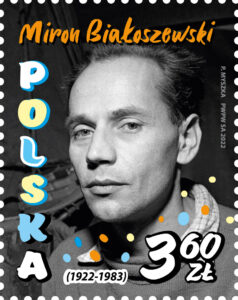
Miron Białoszewski
www.poczta-polska.pl
W dniu 30 czerwca 2022 r. został wprowadzony do obiegu znaczek pocztowy o wartości 3,60 zł emisji “Miron Białoszewski”. Na znaczku – portret Mirona Białoszewskiego – poety, prozaika, dramatopisarza. Na kopercie FDC zamieszczono zdjęcie z jednego ze spektakli prowadzonego przez Mirona Białoszewskiego “Teatru Osobnego” oraz cytat – słowa poety dotyczące jego eksperymentów ze słowem mówionym i pisanym. W grafice datownika – łyżka cedzakowa (wiele miejsca w twórczości poety zajmują przedmioty codziennego użytku, m.in. łyżka cedzakowa, podłoga, piec). Znaczek wydrukowano techniką rotograwiurową, na papierze fluorescencyjnym, format znaczka: 39,5 x 31,25 mm, w nakładzie 100.000 szt. Arkusz sprzedażny zawiera 50 szt. znaczków. Autor projektu: Paweł Myszka.
Miron Białoszewski, którego twórczość zapisała się trwale w dziejach polskiej kultury, to odkrywca nowych form w liryce, prozie, twórczości teatralnej oraz uważny obserwator codzienności. W swoich dziełach wykraczał poza granice przyjętego języka literackiego oraz rozbijał schematyzm. Jego zainteresowanie wzbudzała mowa wykolejona, przejęzyczenia, przypadkowe zbiegi okoliczności językowych. Odwoływał się także do języka potocznego i dziecięcego. Do najważniejszych dzieł artysty należą tomiki wierszy „Obroty rzeczy” i „Mylne wzruszenia” oraz pisany prozą „Pamiętnik z powstania warszawskiego”. Za ten ostatni otrzymał nagrodę miasta Warszawy oraz nagrodę ministra kultury i sztuki II stopnia.
Artysta oprócz pisania, zajmował się również grą aktorską w teatrze. W 1955 roku, wraz z Lechem Emfazym Stefańskim i Bogusławem Choińskim, założył własny amatorski „Teatr na Tarczyńskiej”. Po jego rozpadzie pisarz otworzył w swoim mieszkaniu „Teatr Osobny”, który przetrwał do 1963 roku. Do granych w nich najbardziej znanych sztuk zalicza się „Wyprawy Krzyżowe” i „Osmędeusze”.
Na wyemitowanym przez Pocztę Polską znaczku pocztowym przedstawiony jest fotograficzny portret Mirona Białoszewskiego. Na kopercie FDC zamieszczono zdjęcie artysty wykonane w trakcie jednego ze spektakli „Teatru Osobnego” oraz cytat – słowa poety dotyczące jego eksperymentów ze słowem mówionym i pisanym. W grafice datownika widnieje łyżka cedzakowa – jeden z wysławianych przez Białoszewskiego przedmiotów codziennego użytku, które zajmują wiele miejsca w jego twórczości poetyckiej.
Typografia użyta na znaczku i kopercie nawiązuje do odręcznego pisania oraz śladu zostawianego przez pędzel podczas malowania (ekspresyjne rysunki pędzlem, wycięte potem w tekturze, były stałym elementem scenografii w przedstawieniach Mirona Białoszewskiego). Pojawiają się na nich także kolorowe kropki, mówiące nam, że mamy do czynienia z barwną postacią, nie wpisującą się w patetyczny archetyp poety oraz wskazują na pierwiastek gry i zabawy, obecny w metodzie twórczej Białoszewskiego.
Znaczek z wizerunkiem Mirona Białoszewskiego to kolejna emisja Poczty Polskiej upamiętniająca wybitne postacie ze świata literatury. Tylko w ostatnim czasie do obiegu weszły emisje „ 200. rocznica urodzin Cypriana Kamila Norwida”, „100. rocznica urodzin Stanisława Lema” czy „100. rocznica urodzin Leopolda Tyrmanda”.
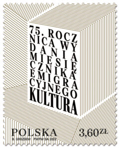
75. rocznica wydania miesięcznika emigracyjnego Kultura
75th Anniversary of the Issue of the
Emigration Monthly Magazine Kultura
www.poczta-polska.pl
W dniu 30 czerwca 2022 r. został wprowadzony do obiegu znaczek pocztowy o wartości 3,60 zł emisji “75. rocznica wydania miesięcznika emigracyjnego Kultura”. W centralnej części znaczka przedstawiono metaforycznie wszystkie wydania miesięcznika od pierwszego do ostatniego numeru, z napisem ,,75. rocznica wydania miesięcznika emigracyjnego ,,Kultura”. Datownik pierwszego dnia obiegu nawiązuje graficznie do wizerunku znaczka. Projekty powstały w oparciu o materiały i przy współpracy PP z Instytutem Literackim w Paryżu. Złoty kolor na znaczku nie jest wykorzystany przypadkiem. Zwielokrotnienie ,,złotych kart” to cenny, wartościowy wkład Instytutu Literackiego i miesięcznika “Kultura” zarówno w kulturę jak i życie polityczne Polaków. Wypełniony stronicami niemal cały obszar znaczka jest przedstawieniem wielości utworów, ale także, dzięki swojemu układowi i użyciu właśnie złotego koloru, również symboliczną wizualizacją emanacji na otoczenie.
Koperta Pierwszego Dnia Obiegu jest dopełnieniem grafiki ze znaczka, a w zestawieniu ze wszystkimi elementami emisji, potęguje wrażenie mnogości druków. Na odbiór obfitości wpływa również kompozycja i dekoracyjny sposób obrazowania, zwany w sztuce ,,horror vacui”, polegający na wypełnieniu niemal całego obszaru projektu. Między kartami można doszukać się zdjęć z działalności Instytutu, postaci ,,Redaktora” Giedroycia oraz znaków korektorskich, geometrycznych brył czy symboli typograficznych. Sam układ graficzny – powielenia, proste kształty, rozrzucone elementy czcionek są nawiązaniem do estetyki tamtych czasów, polskiej awangardy. Odwołują się do prostych form Henryka Starzewskiego, Władysława Strzemińskiego czy Katarzyny Kobry, dziś ponownie aktualnych rozwiązań plastycznych, czytelnych dla współczesnych odbiorców. Znaczek wydrukowano techniką rotograwiurową, na papierze fluorescencyjnym, format znaczka: 31,25 x 39,5 mm , w nakładzie 100.000 szt. Arkusz sprzedażny zawiera 50 szt. znaczków. Autor projektu: Bożydar Grozdew.
75th Anniversary of the Issue of the Emigration Monthly Magazine Kultura … denomination: 3,60 PLN; number of stamps in set: 1; 50 pcs in sheet; print run: 100 000 psc; printing techniques: photogravure; paper: fluorescent; stamp size: 31,25 x 39,5 mm; number of FDC: 1; author: Bożydar Grozdew; circulation date: 30th June 2022.
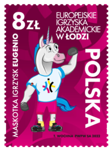
Europejskie Igrzyska Akademickie w Łodzi
www.poczta-polska.pl
15 lipca 2022 zadebiutował znaczek upamiętniający największą imprezę sportu akademickiego na Starym Kontynencie, która po raz pierwszy odbyła się w Polsce, znaczek o wartości 8,00 zł emisji “Europejskie Igrzyska Akademickie w Łodzi”. Tomasz Wochna, autor projektu z Komitetu Organizacyjnego EUG 2022 na grafice znaczka przedstawił oficjalną maskotkę Europejskich Igrzysk Akademickich w Łodzi – jednorożca Eugenia. Jego imię jest nawiązaniem do angielskiej nazwy igrzysk – European Univercities Games. W prawej górnej części znaczka umieszczono napis: Europejskie Igrzyska Akademickie w Łodzi, wzdłuż lewej krawędzi napis: MASKOTKA IGRZYSK EUGENIO, wzdłuż prawej krawędzi jest napis: POLSKA, w lewym górnym rogu oznaczenie wartości: 8 zł.
Z tej okazji została wydana koperta FDC, na której przedstawiono młodych sportowców w akcji: tenisistkę, skoczka w dal na rozbiegu, judoczkę i koszykarza w czarno-białej konwencji. W grafice datownika umieszczono oficjalny logotyp Europejskich Igrzysk Akademickich w Łodzi. Są one imprezą dużej rangi i są organizowane co dwa lata w różnych miastach. Jest to doskonała okazja do promocji naszego kraju na arenie międzynarodowej.
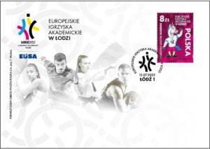
Znaczki wydrukowano techniką offsetową, na papierze fluorescencyjnym, w formacie 31,25 x 43 mm, w nakładzie 126 000 sztuk. Arkusz sprzedażny zawiera 9 sztuk znaczków.
100. rocznica odkrycia pradziejowych kopalń
krzemienia pasiastego w Krzemionkach
www.poczta-polska.pl
W dniu 16 lipca 2022 r. została wprowadzona do obiegu kartka pocztowa z nadrukowanym znakiem opłaty pocztowej, emisji: 100. rocznica odkrycia pradziejowych kopalń krzemienia pasiastego w Krzemionkach. Wartość nominalna znaku opłaty pocztowej z oznaczeniem literowym A odpowiada wartości nominalnej znaczka pocztowego używanego do uiszczenia opłaty za ekonomiczną przesyłkę listową nierejestrowaną, w tym kartkę pocztową, w obrocie krajowym, w formacie S. W prawym górnym rogu strony adresowej kartki nadrukowano znak opłaty pocztowej, na którym umieszczono wizerunek prof. Jana Samsonowicza, a w tle znaczka fotografię przedstawiającą badania archeologiczne kopalń jamowych z 1982 roku. Wzdłuż prawej krawędzi znaczka umieszczono napis: POLSKA, a w prawym dolnym rogu oznaczenie wartości: A. W części ilustracyjnej kartki znajdują się zdjęcie kopalni filarowo-komorowej i bryły krzemienia pasiastego oraz nazwa emisji: ,,100.ROCZNICA ODKRYCIA PRADZIEJOWYCH KOPALŃ KRZEMIENIA PASIASTEGO W KRZEMIONKACH”. Kartkę o wymiarach 148 x 105 mm wydrukowano jednostronnie, techniką offsetową, na kartonie białym, w nakładzie 5000 sztuk. Autorka projektu kartki: Joanna Fleszar-Haspert.
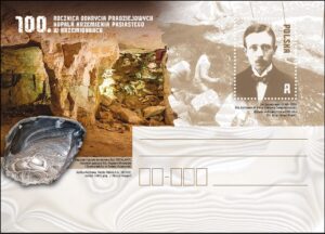
Główne obchody stulecia unikatowych w swoim rodzaju kopalń odbyły się z udziałem przedstawicieli Poczty Polskiej w Muzeum Archeologicznym i Rezerwacie Krzemionki pod Ostrowcem Świętokrzyskim. Spółka 16 lipca wprowadziła tam kartkę „100.rocznica odkrycia pradziejowych kopalń krzemienia pasiastego w Krzemionkach”. W uroczystości uczestniczył Rafał Nowak, wicewojewoda Świętokrzyski oraz Krzysztof Górski, dyrektor Biura Współpracy Międzynarodowej i Filatelistyki Poczty Polskiej, który odczytał list od Tomasza Zdzikota, prezesa zarządu Poczty Polskiej.
– Obok „Krzemionkowskiego Regionu Prehistorycznego Górnictwa Krzemienia Pasiastego” nie da się przejść obojętnie. To miejsce unaocznia, jak bogate wnętrze ma nasza matka – Ziemia. Ta wyjątkowa emisja dotyczy unikatowych, bo bardzo rzadkich kopalń – uznanych w 1994 roku za pomnik historii Polski, a w 2019 roku wpisanych na listę światowego dziedzictwa UNESCO. Krzemionki niewątpliwie należą do miejsc szczególnych, gdzie teraźniejszość spotyka się z prehistorią, gdzie młode pokolenia Polaków mogą „dotknąć” przeszłości i poznać warunki oraz narzędzia używane w górnictwie od wieków. Poczta Polska swoją emisją włącza się w tak ważne krzewienie wiedzy o dziedzictwie kulturowym i historycznym Polski.
Produkty tradycyjne
www.poczta-polska.pl
W dniu 22 lipca 2022 r. została wprowadzona do obiegu kartka pocztowa z nadrukowanym znakiem opłaty pocztowej, emisji: Produkty tradycyjne. Wartość nominalna znaku opłaty pocztowej z oznaczeniem literowym A odpowiada wartości nominalnej znaczka pocztowego używanego do uiszczenia opłaty za ekonomiczną przesyłkę listową nierejestrowaną, w tym kartkę pocztową, w obrocie krajowym, w formacie S. W projekcie kartki w części ilustracyjnej umieszczono tytuł emisji ,,Produkty tradycyjne” oraz zdjęcie przedstawiające sójki mazowieckie na drewnianej tacy. W polu znaku opłaty pocztowej umieszczono grafikę przedstawiającą produkt tradycyjny – sójkę mazowiecką, w lewym górnym rogu umieszczono napis: POLSKA, w prawym górnym rogu oznaczenie wartości: A.
W grafice przywieszki do znaku opłaty pocztowej wymieniono nazwę produktu tradycyjnego: sójka mazowiecka, jego rodzaj: wyroby piekarnicze i cukiernicze, wygląd i smak: większy pieróg z nadzieniem z lekko kwaśnej kapusty z nutą grzybów, przypraw, kaszy jaglanej i smażonego boczku, a także województwo mazowieckie, z którego pochodzi produkt oraz datę wpisu na listę produktów tradycyjnych. Kartka została zaprojektowana we współpracy z Urzędem Miasta i Gminy Cegłów – wnioskodawcą emisji. Kartkę o wymiarach 148 x 105 mm wydrukowano jednostronnie, techniką offsetową, na kartonie białym, w nakładzie 5000 sztuk. Autor projektu kartki: Bożydar Grozdew.

Poczta Polska upamiętnia i honoruje na swoich znaczkach i kartkach nie tylko ważne postacie, wydarzenia czy obiekty architektoniczne. Spółka promuje także dziedzictwo kulturowe oraz wytwory regionalnego rzemiosła, w tym także kulinarnego. Na najnowszej kartce emisji „Produkty tradycyjnie” znalazła się sójka mazowiecka. W projekcie kartki w części ilustracyjnej umieszczono tytuł emisji „Produkty tradycyjne” oraz zdjęcie przedstawiające sójki mazowieckie na drewnianej tacy. Kartce przedstawiającej przysmak ze wschodniego Mazowsza towarzyszy datownik, który będzie stosowany w Urzędzie Pocztowym w Cegłowie. Uroczyste wprowadzenie kartki do obiegu odbyło się w Cegłowie podczas XIV Festiwalu Folkloru i Smaku „Sójka Mazowiecka” 23 lipca 2022 roku.
– Sójka mazowiecka to produkt łatwy w przygotowaniu, tani i, przede wszystkim, niezwykle smaczny. Zgodnie z kultywowanymi tradycjami, bardzo często powstaje na bazie surowców pochodzących z gospodarstw, w których od blisko stu lat przygotowuje się te niezwykłe pierogi. Jestem przekonany, że nasza najnowsza kartka stanie się nie tylko formą docenienia kunsztu kulinarnego wschodnich mazowszan, ale także zainspiruje do skosztowania go wszystkich miłośników tradycyjnej kuchni – podkreślił Daniel Witowski, rzecznik prasowy Poczty Polskiej.
Ten mało jeszcze znany wybór kulinarny z serca Polski zasługuje na promocję nie tylko ze względu na oryginalność, ale – przede wszystkim – niezwykłe walory smakowe. Sójki mazowieckie to sporej wielkości pieczone pierogi wykonane z ciasta drożdżowego, nadzianego kwaszoną kapustą, boczkiem lub słoninką, kaszą jaglaną i grzybami. Tradycja wypieku nietypowego pieroga jest pieczołowicie kultywowana we wschodniej części Mazowsza. Dlatego też pomysłodawcą promocji sójki mazowieckiej na wydawnictwach Poczty Polskiej jest Urząd Miasta i Gminy Cegłów, na terenie których wciąż można raczyć się tym oryginalnym, tradycyjnym wytworem sztuki kulinarnej.
Polskie produkty regionalne
www.poczta-polska.pl
W dniu 27 lipca 2022 r. został wprowadzony do obiegu znaczek pocztowy o wartości 8,00 zł emisji “Polskie produkty regionalne”. W ramach tegorocznej emisji prezentujemy na znaczku kolejny produkt z listy “Chronione Oznaczenie Geograficzne”, tj. znany wszystkim obwarzanek krakowski, wytwarzany w Krakowie i okolicach stolicy małopolski. Znaczek wydrukowano techniką offsetową z suchym tłoczeniem, na papierze fluorescencyjnym, format znaczka: 43 x 31,25 mm, w nakładzie 144.000 szt. Arkusz sprzedażny zawiera 9 szt. znaczków. Z tej okazji została wydana również koperta FDC. Autor projektu znaczka: Agnieszka Sancewicz.
Tegoroczny znaczek stanowi kontynuację zapoczątkowanej niemal dekadę temu serii „Polskie produkty regionalne”. W kolejnych latach Poczta prezentowała różnorodne produkty i wyroby (cukiernicze, mięsne, owoce) z różnych części naszego kraju. Emisja jest promocją Polski i certyfikowanych polskich produktów regionalnych, zarejestrowanych i objętych ochroną przez Komisję Europejską, wpisanych na listę produktów „Chronione Oznaczenie Geograficzne” prowadzoną przez Ministerstwo Rolnictwa i Rozwoju Wsi. Cechą charakterystyczną serii jest drukowanie znaczków z zastosowaniem techniki suchego tłoczenia, dzięki czemu umieszczony na znaczku produkt sprawia wrażenie „trójwymiarowego”. Ponadto nieodzownym elementem projektu jest logo certyfikatu „Chronione Oznaczenie Geograficzne”. To wyróżnienie podkreśla związek między konkretnym regionem geograficznym a nazwą produktu, lecz szczególnie – jakość produktu, jego renomę lub inną wyjątkową cechę, związaną z miejscem pochodzenia.
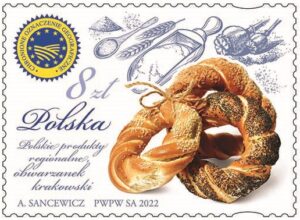
– Rozpoczęty w 2013 roku cykl znaczków z produktami regionalnymi miał rozpowszechniać wiedzę o fantastycznych polskich wyrobach. Swoje zadanie spełnia doskonale, bo każdy ze znaczków tej serii jest oczekiwany z wielką niecierpliwością. Obwarzanek krakowski, dostępny na znaczku pocztowym, będzie od teraz w świecie popularyzował wyjątkowość i jednocześnie różnorodność kulinarną polskich regionów. Tak jak do tej pory robią to na znaczkach truskawka kaszubska, jabłko łąckie, ser koryciński, miód kurpiowski, rogal świętomarciński i czosnek galicyjski – powiedział wiceprezes Poczty Polskiej Wiesław Włodek.
Obwarzanek krakowski to wypiek przypominający pierścień, owal, rzadziej przybierający formę regularnego kółka, utworzony ze splotu ciasta z otworem w środku. Każdy taki wypiek ma inny kształt ze względu na ręczne obrabianie i formowanie ciasta. Obwarzanki krakowskie znane są od XIV wieku i obecnie piecze się je każdego dnia. Receptury były przekazywane w formie ustnej z pokolenia na pokolenie przez piekarzy z Krakowa i jego okolic. Nazwa wypieku wywodzi się od sposobu jego produkcji – obwarzania, czyli obgotowywania ciasta oraz tradycji wypieku i spożywania obwarzanków w okresie Wielkiego Postu kultywowanej na tym obszarze. Obwarzanek krakowski stanowi obok lajkonika, trębacza i hejnału z wieży Mariackiej, smoka wawelskiego jeden z najważniejszych rozpoznawalnych znaków Krakowa.
100-lecie pierwszego meczu rugby w Polsce
www.poczta-polska.pl
W dniu 29 lipca 2022 r. została wprowadzona do obiegu kartka pocztowa z nadrukowanym znakiem opłaty pocztowej, emisji: 100-lecie pierwszego meczu rugby w Polsce. Wartość nominalna znaku opłaty pocztowej z oznaczeniem literowym A odpowiada wartości nominalnej znaczka pocztowego używanego do uiszczenia opłaty za ekonomiczną przesyłkę listową nierejestrowaną, w tym kartkę pocztową, w obrocie krajowym, w formacie S. W prawym górnym rogu strony adresowej kartki nadrukowano znak opłaty pocztowej, na którym przedstawiono logotyp pierwszej reprezentacji Polski, drużyny ,,Orzeł Biały”. Wzdłuż dolnej krawędzi znaczka umieszczono napis: POLSKA oraz oznaczenie wartości: A. W części ilustracyjnej kartki, w tle, znajduje się piłka do gry w rugby.

W górnej części umieszczono zdjęcie pierwszego zespołu rugby ,,Orzeł Biały” z 1922 roku, w środkowej części zdjęcie z pierwszego powojennego meczu reprezentacji Polski z Niemiecką Republiką Demokratyczną w 1958 roku, a w dolnej części zdjęcie reprezentacji kobiet z mistrzostw Europy w 2022 roku w Krakowie. Kartkę o wymiarach 148 x 105 mm wydrukowano jednostronnie, techniką offsetową, na kartonie białym, w nakładzie 5000 sztuk. Autor projektu kartki: Jacek Konarzewski.
Janusz Korczak – wybitny pedagog, lekarz, społecznik
www.poczta-polska.pl
W dniu 4 sierpnia 2022 r. została wprowadzona do obiegu kartka pocztowa z nadrukowanym znakiem opłaty pocztowej, emisji: Janusz Korczak – wybitny pedagog, lekarz, społecznik. Wartość nominalna znaku opłaty pocztowej z oznaczeniem literowym A odpowiada wartości nominalnej znaczka pocztowego używanego do uiszczenia opłaty za ekonomiczną przesyłkę listową nierejestrowaną, w tym kartkę pocztową, w obrocie krajowym, w formacie S.
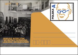
Na nadrukowanym znaku opłaty pocztowej przedstawiono graficzny wizerunek twarzy Janusza Korczaka. W części ilustracyjnej kartki znajduje się fragment archiwalnej fotografii, nazwa emisji i podpis zdjęcia: Jadalnia w Domu Sierot Korczaka,1940, getto warszawskie. W górnym,lewym rogu kartki umieszczono logotyp Żydowskiego Instytutu Historycznego. Wnioskodawcą emisji jest Żydowski Instytut Historyczny im. Emanuela Ringelbluma w Warszawie. W 2022 roku obchodzona jest również 80 rocznica śmierci Janusza Korczaka upamiętniona poprzez wiele wydarzeń edukacyjnych organizowanych przez Żydowski Instytut Historyczny w kraju i za granicą. Kartkę o wymiarach 148 x 105 mm wydrukowano jednostronnie, techniką offsetową, na kartonie białym, w nakładzie 5000 sztuk. Autor projektu kartki: Jan Konarzewski.
Polskie Madonny
www.poczta-polska.pl
Poczta Polska rozpoczęła nową serię wydawniczą emisji „Polskie Madonny”, której celem jest zaprezentowanie wizerunków Matki Bożej z różnych miast Polski. Pierwsze znaczki prezentują Matkę Bożą Dzierżoniowską – Matkę Miłosierdzia i Matkę Bożą Uśmiechniętą z Pszowa.
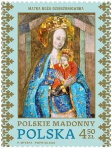
W dniu 12 sierpnia 2022 roku zostały wprowadzone do obiegu dwa znaczki pocztowe o wartości 4,50 zł emisji “Polskie Madonny”. Na pierwszym znaczku przedstawiono wizerunek Matki Bożej Dzierżoniowskiej, której obraz znajduje się w kościele św. Jerzego w Dzierżoniowie. Został on wykonany w technice fresku w ok. 1500 r. (format ok. 40 x 50 cm). Wizerunek Matki Bożej z Dzieciątkiem został odkryty podczas prac konserwatorskich prowadzonych we wnętrzu kościoła w 2008 r. Stanowi on część skromnego ołtarza, który znajdował się we wschodnim narożniku nawy południowej.

Z zachowanych dokumentów wynika, że w kościele istniał kiedyś kult wizerunku Marii, który nosił nazwę ,,Salve Regina” od pierwszych słów pieśni, które w polskim tłumaczeniu brzmią następująco: Witaj Królowo, Matko Miłosierdzia. Stąd właśnie zaczerpnięto współczesny tytuł dla odkrytego wizerunku Maryi: Matka Boska Dzierżoniowska – Matka Miłosierdzia. Obecnie wizerunek nosi szaty wotywne i korony wykonane przez pracownię Mariusza Drapikowskiego. W 2017 r. odbyła się koronacja fresku Matki Boskiej Dzierżoniowskiej – Matki Miłosierdzia. W projekcie koperty FDC widoczne jest wnętrze kościoła pw. św. Jerzego w Dzierżoniowie, zaś na datowniku okolicznościowym – grafika obłoku.

Na drugim znaczku przedstawiono wizerunek Matki Bożej Uśmiechniętej z Pszowa. Wizerunek Matki Bożej Uśmiechniętej z Pszowa pochodzi z początku XVIII w. i jest kopią obrazu Matki Bożej z Jasnej Góry w Częstochowie, zakupiony dla kościoła parafialnego pw. Narodzenia NMP w 1722 r. Wielokrotne przemalowania, ostatnie w 1976 r. zmieniły pierwotny charakter wizerunku. W 2002 r. obraz został koronowany w imieniu papieża Jana Pawła II.
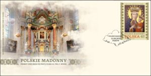
W projekcie koperty FDC widoczne jest wnętrze Bazyliki pw. Narodzenia NMP w Pszowie, zaś na datowniku okolicznościowym – grafika obłoku. Znaczki wydrukowano techniką rotograwiurową, na papierze fluorescencyjnym, w formacie 40,5 x 54 mm, w nakładzie 117 000 sztuk każdego. Arkusz sprzedażny zawiera 9 sztuk znaczków. Autor projektu: Paweł Myszka.
XIII Międzynarodowy Kongres Nauk
Historycznych Poznań 2020/2022
www.poczta-polska.pl
W dniu 21 sierpnia 2022 r. została wprowadzona do obiegu kartka pocztowa z nadrukowanym znakiem opłaty pocztowej, emisji: XIII Międzynarodowy Kongres Nauk Historycznych Poznań 2020/2022. Wartość nominalna znaku opłaty pocztowej z oznaczeniem literowym A odpowiada wartości nominalnej znaczka pocztowego używanego do uiszczenia opłaty za ekonomiczną przesyłkę listową nierejestrowaną, w tym kartkę pocztową, w obrocie krajowym, w formacie S. Celem emisji jest promocja XIII Międzynarodowego Kongresu Nauk Historycznych w Poznaniu, który odbędzie się w dn. 21-27.08.2022 r. Na znaczku przedstawiono wizerunek Collegium Minus Uniwersytetu A. Mickiewicza w Poznaniu.

W części ilustracyjnej kartki znajduje się wizerunek Centrum Kultury ZAMEK w Poznaniu, zaś powyżej logo XIII Międzynarodowego Kongresu Nauk Historycznych Poznań 2020/2022, zaś na datowniku okolicznościowym grafika zaczerpnięta z identyfikacji wizualnej Kongresu. Emisja została zrealizowana we współpracy z: Uniwersytetem A. Mickiewicza w Poznaniu, organizatorem Kongresu Centrum Kultury ZAMEK w Poznaniu, miejsce obrad Kongresu. Kartkę o wymiarach 148 x 105 mm wydrukowano jednostronnie, techniką offsetową, na kartonie białym, w nakładzie 5000 sztuk. Autor projektu kartki: Jan Konarzewski.
100. rocznica odkrycia zespołu pradziejowych
kopalni krzemienia pasiastego „Krzemionki”
www.nbp.pl
Narodowy Bank Polski jest centralnym bankiem państwa odpowiadającym za politykę pieniężną i stabilność cen. Jego funkcje określa Konstytucja Rzeczypospolitej Polskiej i ustawa o NBP. NBP ma wyłączne prawo emisji pieniądza. Jako bank centralny nie prowadzi rachunków bankowych obywateli, nie przyjmuje od nich lokat, nie udziela kredytów. Prowadzi natomiast obsługę budżetu państwa, a także podmiotów sektora finansów publicznych. Gromadzi rezerwy walutowe państwa i zarządza nimi. Pełni funkcję banku banków, tworząc warunki do działania systemu bankowego. Jest również jednym z najważniejszych ośrodków naukowo-analitycznych w dziedzinie ekonomii i rynków finansowych.
Emisja wartości kolekcjonerskich stanowi okazję do upamiętniania ważnych historycznych rocznic i postaci oraz do rozwijania zainteresowań polską kulturą, nauką i tradycją. 12 lipca 2022 roku Narodowy Bank Polski wprowadził do obiegu srebrną monetę o nominale 50 zł „100. rocznica odkrycia zespołu pradziejowych kopalni krzemienia pasiastego »Krzemionki«”.
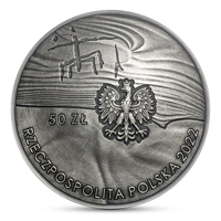
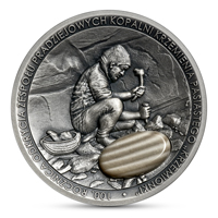
Nominał: 50 zł … metal: Ag 999/1000; stempel: zwykły, soczewka, wysoki relief, krzemień pasiasty, oksyda; średnica: 45,00 mm; masa: 62,20 g; brzeg (bok): gładki; nakład: do 7000 szt.; Projektant: Urszula Walerzak; Emitent: NBP; Na zlecenie NBP monety wyprodukowała Mennica Polska S.A.
Sto lat temu 19 lipca 1922 r. młody geolog Jan Samsonowicz w czasie badań terenowych przemierzał pola wsi Krzemionki położonej w ówczesnym powiecie opatowskim w województwie kieleckim. Wśród pól i łąk natrafił na duże nagromadzenie niezwykłych, lejowatych zagłębień. Okazały się one prehistorycznymi szybami górniczymi. Samsonowiczowi udało się zejść do kilku pradziejowych wyrobisk, w których znalazł pierwotne narzędzia górnicze wykonane z krzemienia i poroża. Po przeprowadzeniu niezbędnych oględzin i pomiarów zdał sobie sprawę, że ma do czynienia z wyjątkowym, epokowym odkryciem. Odnalazł rozległe prehistoryczne kopalnie krzemienia pasiastego, które funkcjonowały tu w neolicie i we wczesnej epoce brązu (ok. 3900–1600 lat przed Chrystusem).
Pierwsze wykopaliska archeologiczne w Krzemionkach rozpoczął w 1925 r. Józef Żurowski. Miejsce stało się obiektem badań prowadzonych przez kilka pokoleń polskich archeologów. Dzięki ich pracy udało się zgromadzić imponującą wiedzę o życiu i pracy pradziejowych górników, którzy tysiące lat temu wydobywali tu krzemień pasiasty i wyrabiali z niego głównie polerowane siekiery. W III tysiącleciu przed Chrystusem rozprowadzano je w promieniu 660 kilometrów od kopalni. W Krzemionkach wydrążono 4 tysiące kopalni krzemienia, które tworzą pole górnicze zajmujące powierzchnię ok. 78 hektarów. Zachowały się zarówno podziemne, wykute w skale wapiennej wyrobiska, jak i powierzchniowy krajobraz przekształcony przez pradziejową działalność wydobywczą. Dziś obiekt znajduje się pod opieką Muzeum Historyczno-Archeologicznego w Ostrowcu Świętokrzyskim i wchodzi w skład rezerwatu przyrody. Zwiedzającym udostępniono jego zbiory oraz podziemną trasę turystyczną.
W 2019 r. Krzemionki wraz ze stanowiskami archeologicznymi (pola górnicze Borownia i Korycizna, neolityczna osada na wzgórzu Gawroniec w Ćmielowie) zostały wpisane na listę światowego dziedzictwa UNESCO. Na rewersie monety wyemitowanej z okazji 100. rocznicy odkrycia kopalni znajdują się: wizerunek pradziejowego górnika w czasie pracy i eliptyczna wstawka z krzemienia pasiastego. Na awersie monety widnieje charakterystyczny symbol Wielkiej Matki. Jest to rysunek wykonany węglem drzewnym na powierzchni wapiennego filara jednej z kopalni w Krzemionkach. Przedstawia najprawdopodobniej postać związaną z wierzeniami i mitologią neolitycznych górników. Stanowi jeden z kilku przykładów pradziejowej sztuki naskalnej z obszaru współczesnej Polski. Obecnie znajduje się w logotypie Muzeum Archeologicznego i Rezerwatu „Krzemionki” (oddziału Muzeum Historyczno-Archeologicznego w Ostrowcu Świętokrzyskim). Informacja: Muzeum Historyczno-Archeologiczne w Ostrowcu Świętokrzyskim.
![]()
100th Anniversary of the Discovery of the Complex
of Prehistoric Striped Flint Mines “Krzemionki”
www.nbp.pl
Narodowy Bank Polski is the central bank of the State, responsible for its monetary policy and price stability. The Bank’s functions are described in the Constitution of the Republic of Poland and the Act on NBP. NBP holds the exclusive right to issue the currency of the Republic of Poland. As the central bank, it does not provide accounts for the general public, accept deposits from or extend loans to individuals. It acts as a banker to the State budget and public sector entities. NBP also holds and manages the foreign exchange reserves of the State. Finally, it functions as a banker to banks, creating conditions for the operation of the Polish banking system. Narodowy Bank Polski is one of the most important research and analytical centres in the fields of economics and financial markets.
Issuing collector items is an occasion to commemorate important historic figures and anniversaries, as well as to develop the interest of the public in Polish culture, science and tradition. On 12 July 2022, Narodowy Bank Polski issued into circulation a silver coin “100th Anniversary of the Discovery of the Complex of Prehistoric Striped Flint Mines ‘Krzemionki’”, with a face value of 50 złoty.
Face value: 50 zł … Metal: Ag 999/1000; Finish: standard (lens-shaped, high relief, striped flint, oxidised); Diameter: 45.00 mm; Weight: 62.20 g; Edge (side): plain; Mintage: up to 7,000 pcs; Designer: Urszula Walerzak; Issuer: NBP; The coins, commissioned by NBP, were struck by Mennica Polska S.A.
One hundred years ago, on 19 July 1922, a young geologist Jan Samsonowicz was exploring the fields of Krzemionki village in the former Opatów district of the Kieleckie voivodship. Among the fields and meadows, he came across a large concentration of unusual, funnel-shaped cavities. They turned out to be prehistoric mining shafts. Samsonowicz managed to descend into several prehistoric pits, where he found the original mining tools made of flint and antlers. Having carried out the necessary inspections and measurements, he realised that he was dealing with a unique, unprecedented discovery. He found extensive prehistoric striped flint mines which had operated there during the Neolithic and Early Bronze Age (approx. 3900-1600 BC).
The first archaeological excavations in Krzemionki were started in 1925 by Józef Żurowski. The site became the scene of research conducted by several generations of Polish archaeologists. Owing to their work, it was possible to gather impressive knowledge about the life and work of prehistoric miners who thousands of years ago used to extract striped flint in this area and who had mainly used it to make polished axes. In the third millennium BC they were distributed within a range of 660 kilometres from the mines. In Krzemionki, four thousand mines of striped flint had been dug, forming a mining field covering an area of about 78 hectares. Both the underground workings, carved into the limestone rock, and the surface landscape transformed by prehistoric mining activities are well-preserved. Today the site remains under the protection of the Historical and Archaeological Museum in Ostrowiec Świętokrzyski and is a part of the nature reserve. Its collections and the underground tourist route are open to visitors.
In 2019, Krzemionki together with the archaeological sites (the Borownia and Korycizna mining fields, the Neolithic settlement on the Gawroniec hill in Ćmielów) were inscribed on the UNESCO World Heritage List. The reverse of the coin issued to commemorate the 100th anniversary of the discovery of the mines features an image of a prehistoric miner at work and an elliptical insert made of striped flint. The obverse of the coin shows the characteristic symbol of the Great Mother. This is a charcoal drawing made on the surface of a limestone pillar of one of the mines in Krzemionki. It probably presents a figure associated with the beliefs and mythology of the Neolithic miners. It is one of several examples of prehistoric rock art in contemporary Poland. It is currently incorporated into the logotype of the Archaeological Museum and the “Krzemionki” Reserve (a branch of the Historical and Archaeological Museum in Ostrowiec Świętokrzyski). Info: Historical and Archaeological Museum in Ostrowiec Świętokrzyski.
Indigenous Leaders – Chief Marie-Anne Day Walker-Pelletier:
PermanentTM domestic rate stamps
www.canadapost.ca
Pay tribute to Chief Marie-Anne Day Walker-Pelletier – 40-year leader of the Okanese First Nation – with this booklet of 6 PermanentTM domestic rate stamps. The booklet cover features an enlargement of the stamp image, along with the crest of the Okanese First Nation (Band No. 382) in Saskatchewan. The inside background features a photo of the land of the Okanese First Nation, by Cory Generoux. This stamp, part of the inaugural three-stamp Indigenous Leaders issue, pays tribute to Walker-Pelletier, who spent nearly 40 years as leader of the Okanese First Nation in Saskatchewan – the most consecutive terms ever served by an elected First Nations chief in Canada.

Designed by Lime Design, this stamp features a photograph of Marie-Anne Day Walker-Pelletier taken in 2019 by her daughter, Ilona Lee Pelletier, at a ceremony celebrating her appointment as a Member of the Order of Canada. The background is a photograph by Cory Generoux of ceremonial teepees on Treaty 4 territory in Fort Qu’Appelle, Saskatchewan.
No other elected First Nations chief in Canada has served more consecutive terms than Chief Marie-Anne Day Walker-Pelletier (b. 1954, Regina, Saskatchewan). During her nearly 40 years as leader of the Okanese First Nation, on Treaty 4 territory near Fort Qu’Appelle, Saskatchewan, she forged her reputation as a matriarch and champion of her people. Day Walker-Pelletier fought to improve the quality of life of the Okanese and to protect the culture, rights and traditions of all First Nations people through her involvement in numerous tribal, provincial and national initiatives on social reform, health and wellness, and education. A survivor of the residential school system, she was particularly passionate about bettering the lives of women and children. In 2021, a year after she retired, her decade-long dream to reintegrate Indigenous foster children into their families culminated in the opening of the Daywalker Home Fire Family Centre. On her appointment as a Member of the Order of Canada in 2018, Tribal Chief Edmund Bellegarde praised the positive impacts of her long-standing leadership: “She casts a big shadow and her voice is thundering; when she speaks, people listen.”

Stamp Designer: Lime Design; Stamp Value: Permanent™ domestic rate; Quantity Produced: 100,000; Issue Date: June 21, 2022. Official First Day Cover (OFDC)… tribute to Chief Marie-Anne Day Walker-Pelletier – 40-year leader of the Okanese First Nation. The front of the OFDC is a photograph by Cory Generoux of the Daywalker Home Fire Family Centre, located on the Okanese First Nation in Saskatchewan. The cancel mark features the crest of the Okanese First Nation (Band No. 382) in Saskatchewan. Cancellation Site: Fort Qu’Appelle, SK. Stamp Designer Lime Design; OFDC Quantity Produced: 6,000; Issue Date June 21, 2022.
Indigenous Leaders – Jose Kusugak:
PermanentTM domestic rate stamps
www.canadapost.ca
Pay tribute to Jose Kusugak – Inuit activist, linguist and broadcaster – with this booklet of 6 PermanentTM domestic rate stamps. The front of the booklet features an enlargement of the stamp image. The inside of the booklet features a photo of a young Kusugak (right) with other family members, circa 1955. This stamp, part of the inaugural three-stamp Indigenous Leaders issue, pays tribute to Kusugak, who, through his decades of hard work, was a major contributor to securing the land claims that led to the creation of Nunavut in 1999.

The stamp, designed by Andrew Perro, features a photograph of Jose Kusugak, along with his name written in Inuktitut. Considered by some to be a Father of Confederation for his pivotal role in the creation of Nunavut, Jose Kusugak (1950-2011) dedicated his life to raising awareness of Inuit identity and issues in Canada. Kusugak was born in Repulse Bay, Northwest Territories (now Naujaat, Nunavut) and attended residential school as a child. He began his career as a teacher, working at the University of Saskatchewan’s Eskimo Language School and the Churchill Vocational Centre in Manitoba, where he later served as a cultural and linguistic adviser. As head of the Inuit Language Commission in the 1970s, he was involved in developing a standardized, dual writing system for Inuktitut, using Roman orthography and syllabics. In the years leading up to Nunavut’s creation, Kusugak used his natural ability as a communicator to explain the land claim concept to Inuit communities across the Arctic and lent his talent and leadership to many other roles. An award-winning broadcaster and the president of Nunavut Tunngavik Incorporated, Inuit Tapiriit Kanatami and the Kivalliq Inuit Association, Kusugak was an honest and devoted advocate for his people, whom he described as “First Canadians, Canadians First.”
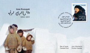
Stamp Designer: Lime Design; Stamp Value: Permanent™ domestic rate; Quantity Produced: 100,000; Issue Date: June 21, 2022. Official First Day Cover (OFDC) … tribute to Jose Kusugak – Inuit activist, linguist and broadcaster. The OFDC cover features a photo of a young Kusugak (right) with other family members, circa 1955. This stamp, part of the inaugural three-stamp Indigenous Leaders issue, pays tribute to Kusugak, who, through his decades of hard work, was a major contributor to securing the land claims that led to the creation of Nunavut in 1999. The cancellation site is Rankin Inlet, Nunavut, the long-time home of Jose Kusugak. The cancellation date – June 21 – is National Indigenous Peoples Day. Cancellation Site: Rankin Inlet, NU. Stamp Designer: Lime Design; OFDC Quantity Produced: 6,000; Issue Date June 21, 2022.
Indigenous Leaders – Harry Daniels:
PermanentTM domestic rate stamps
www.canadapost.ca
Pay tribute to Harry Daniels – politician, activist, writer and actor – with this booklet of 6 PermanentTM domestic rate stamps. The booklet cover features an enlargement of the stamp. The inside background shows a Métis sash, photographed by Danielle Tocker. This stamp, part of the inaugural three-stamp Indigenous Leaders issue, pays tribute to Daniels, who dedicated his life to the rights and well-being of Métis and non-status Indians in Canada.
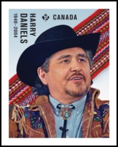
Designed by Lime Design, the stamp features a Canadian Press photo of Harry Daniels taken at a press conference in Ottawa in January 1998, along with a Métis sash (photographed by Danielle Tocker). Known for his sharp wit, zest for life and the broad-brimmed black hat that he sported in honour of his bison-hunting forefathers, Harry Daniels (1940-2004) wore his Métis heritage with pride. The charismatic and outspoken politician, activist and actor was born in Regina Beach, Saskatchewan, and served in the Royal Canadian Navy before entering university, where he developed a lifelong interest in Indigenous affairs. He founde]d or served as a member of a number of Métis organizations and was elected president of the Native Council of Canada and its successor, the Congress of Aboriginal Peoples. Daniels was a force to be reckoned with and successfully led an effort to have the Métis included as one of the Indigenous peoples recognized in the Constitution Act, 1982. In 1999, he and several other plaintiffs launched a Federal Court case that – a dozen years after his death – resulted in the Supreme Court ruling that Métis and non-status Indians are Indians under the British North America Act, 1867, and, therefore, under federal jurisdiction. For his many contributions, he was awarded the Order of the Métis Nation.

Stamp Value: Permanent™ domestic rate; Quantity Produced: 100,000; Stamp Designer: Lime Design; Issue Date: June 21, 2022. Official First Day Cover (OFDC) … tribute to Harry Daniels – politician, activist, writer and actor – with this The front of the OFDC shows a photograph of the Supreme Court in Ottawa. On the back is a photograph of the black hat Daniels wore in honour of his Métis forefathers, photographed by Danielle Tocker. This stamp, part of the inaugural three-stamp Indigenous Leaders issue, pays tribute to Daniels, who dedicated his life to the rights and well-being of Métis and non-status Indians in Canada. The cancellation site is Regina Beach, Saskatchewan, where Daniels was born. The cancellation date: June 21 – is National Indigenous Peoples Day. The cancel mark features the infinity symbol, from the Métis flag, which signifies the union of two cultures and the immortality of the Métis Nation. Cancellation Site: Regina Beach, SK. Stamp Designer: Lime Design: OFDC Quantity Produced: 6,000; Issue Date: June 21, 2022.
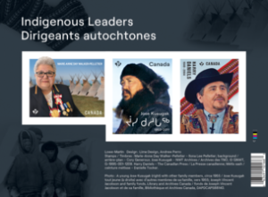
Indigenous Leaders: Souvenir sheet … Tribute to Jose Kusugak, Marie-Anne Day Walker-Pelletier and Harry Daniels with this souvenir sheet for the Indigenous Leaders stamp issue. Designed by Andrew Perro, it features all three stamps and a background photograph pertaining to each leader: ***Jose Kusugak (Inuit): a childhood photo of Kusugak with other family members, circa 1955. ***Chief Marie-Anne Day Walker-Pelletier (First Nations): ceremonial teepees in Fort Qu’Appelle, Saskatchewan, photographed by Cory Generoux. ***Harry Daniels (Métis): a Métis sash, photographed by Danielle Tocker.
$50 … Pure Silver Coin – Canadian Ghost Ship
www.mint.ca
For more than 200 years, there have been reports of an eerie apparition in Chaleur Bay and in the Northumberland Strait. Some describe a glowing ball of fire; others have seen a manned, three-masted ship with sails all aflame. Those who have attempted a rescue remember approaching the glowing vessel, only for the ship to suddenly vanish without a trace… A black light-activated colour reveal … Innovative Colour Reveal technology makes it possible to witness a “ghostly” apparition on this pure silver coin. A new ghostly tale … You may have met a ghost bride (2014), a headless brakeman (2015) and the ghost of Bell Island (2016),or had a haunting experience at an Ottawa hostel (2019). But this ghost story has never been featured on a coin issued by the Royal Canadian Mint—until now. Incredibly detailed … From the traditional dory on the engraved shore to the hidden ghost ship on the horizon, every aspect of this design is carefully detailed to reflect our love for a good ghost story.
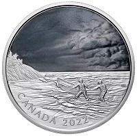
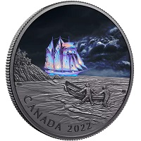
Face value: 50 dollars … Composition: 99.99% pure silver
black light-activated colour revealEmbellishmentsGlow
in the dark; Mintage: 1,500; Finish: Proof; Weight: 157.6g;
Diameter: 65.25 mm; Edge: serrated; Certificate: Serialized;
Artist: Neil Hamelin (reverse), Susanna Blunt (obverse).
Did You Know? … *** Canada’s famous “fire ship” is most often seen in Chaleur Bay (or the Bay of Chaleur, as it’s informally known) but there have also been reported sightings in the Northumberland Strait, in different sections along the coast of New Brunswick, Prince Edward Island and Nova Scotia. *** Some have theorized that the apparition is St. Elmo’s Fire, a phenomenon in which electricity discharged from the atmosphere presents itself as glowing light on tall, sharply pointed structures—like a ship’s mast. *** The phantom ship is also known as “Le feu du mauvais temps” in the Chaleur Bay region, where its appearance heralds an approaching storm. Some have suggested it is caused by an atmospheric discharge. Others think it could be caused by a phosphorus discharge from the depths of Chaleur Bay, like the “will o’ the wisp” phenomenon, where a flame-like glow is seen at night in marshes and swampy areas.
The reverse design by Canadian artist Neil Hamelin travels to the shores of Atlantic Canada, where two local sailors push a dory into the rough surf. They are attempting a rescue just as the storm rolls in, but the ship in need is only visible when the scene is viewed under black light. With Colour Reveal technology, a three-masted ship appears on the horizon and seems to be ablaze from bow to stern… but is it real or is it an illusion? The reverse includes the words “CANADA” and “2022”. The obverse features the effigy of Her Majesty Queen Elizabeth II by Susanna Blunt.
Neil Hamelin, Artist … The viewer is sure of one fact, and that’s the sighting. What the apparition is… that’s where the story takes root! On a moonlit night with a storm rolling in, our fishermen see a ship and it appears to be in great distress. Is it an illusion or is the ship truly in flames? The unknown makes for a great mystery!
2022 … Renewed Silver Toonie:
Path of Knowledge
www.mint.ca
Enhanced with selective gold plating, your coin’s reverse is a reproduction of the Path of Knowledge $2 circulation coin designed by Canadian artist Tony Bianco and issued in July 2000 to mark a new millennium. Its image of a female polar bear with her two cubs represents the transfer of knowledge from one generation to the next, as indicated by the inscription “KNOWLEDGE | LE SAVOIR” on the outer circle inside the rim. The selectively gold-plated obverse features the 1990-2002 effigy of Her Majesty Queen Elizabeth II by Dora de Pédery-Hunt.
A precious metal upgrade … The combination of 99.99% pure silver and selective 99.99% pure gold plating re-creates the distinctive colour contrast that makes Canada’s bi-metallic $2 coin so unique. This is a renewed and enhanced version of the 2000 coin, and nearly twice the size too! Historic obverse … Just like the original coin issued in 2000, this larger-sized collectible features the diademed effigy by Dora de Pédery-Hunt; the historic effigy was in use from 1990 until 2002, before it was replaced in 2003 by the current “uncrowned” effigy by Susanna Blunt.

Face value: 2 dollar … Composition: 99.99% pure silver
with selective gold plating; Mintage: 2,500;
Finish: Proof; Weight: 62.69g; Certificate: Serialized;
Diameter: 50 mm; Edge: serrated; Artist:
Tony Bianco (reverse), Dora de Pédery-Hunt (obverse).
Did You Know? … The Path to Knowledge $2 coin made its big debut on July 1, 2000—Canada Day. It was launched at a citizenship ceremony at Downsview, Toronto.
2022 … Fine Silver Coin –
Visions of Canada
www.mint.ca
Mountains, prairies, forests and more—so many different landscapes are synonymous with Canada, and our natural diversity is truly one of our great strengths. Canadians can be proud of the staggering beauty that defines our nation on a global scale, a beauty that is represented on this coin’s reverse, where some of this country’s most impressive scenes are combined to form a single vision of “home” that will speak to every Canadian. Canada, let your spirit soar! This unique fly-over perspective is a celebration of all things Canadian.
A glimpse of “home” … Immerse yourself in the sights with this unique view of Canada from coast to coast to coast! The ever-changing Canadian landscape unfolds on your coin’s reverse, where so many breath taking sights are seamlessly combined to form a single, inspiring image of Canada. A celebration of Canada … Canada is a country like no other, and nature matters to Canadians. This coin celebrates the popular vision of Canada as a country defined by diversity, its natural beauty and vast wilderness. Obverse field pattern … A nod to the reverse design, your coin’s obverse features a wave pattern that adds a sense of movement, like the wind sweeping across the landscape.

Face value: 30 dollars … Composition: 99.99% pure silver;
Mintage: 5,000; Finish: Proof; Weight: 62.69g;
Diameter: 50 mm; Edge: serrated; Certificate: Serialized;
Artist: Claire Watson (reverse), Susanna Blunt (obverse).
Did You Know? … ***Canada is the third-most forested country in the world, with 347 million hectares of forest covering 38% of our country’s total land area. ***Canada has more lake area than any other country in the world! The five Great Lakes that straddle the Canada-United States border are some of the largest lakes in the world. But many of our largest bodies of water (rivers and lakes) are located in Northern Canada—that’s where you’ll find our longest river, the Mackenzie River (4,241 km long), and the largest lake wholly within Canada, Great Bear Lake. ***Appearing on your coin’s reverse, the Canada jay (also known as the grey jay or whisky jack) is a year-round resident of our boreal forests and can be found in every Canadian province and territory.
Designed by artist Claire Watson, your coin’s reverse captures both the pride of Canadians and the diverse beauty of Canada in a single image that is sure to inspire. A Canada jay (Perisoreus canadensis) symbolizes this nation’s spirit as it glides above the treetops, while the ever-changing Canadian landscape unfolds below—from towering peaks to mighty rivers, and the dancing lights of the aurora borealis. The obverse features the effigy of Her Majesty Queen Elizabeth II and a wave field pattern that evokes a sense of movement, like the wind sweeping across the landscape.
Claire Watson, Artist … Having been raised on Vancouver Island, I have always sought solace in wild spaces and I have a deep appreciation for the vastness and diversity of the Canadian landscape—the uniqueness of each coast, the forests, the rugged mountains, the northern tundra, and the grasslands that tie them all together.
Libby Sim, Product Manager, Royal Canadian Mint … It’s a challenge to capture Canada’s diversity and spirit in a single image, but this design does it beautifully and seamlessly. To me, this coast-to-coast-to-coast portrait speaks to the pride we Canadians have for our home; it even evokes travel memories that have shaped my own view of Canada.
2022 … Pure Gold Coin –
Celebrating Canada’s Diversity: Culture and Traditions
www.mint.ca
Music, dancing, art, food and storytelling—French-Canadian traditions are many and varied, but they all have one thing in common: they make Canada’s cultural mosaic more distinct, vibrant and exciting! The sparkling blue sapphire on this 99.99% pure gold coin serves as a vibrant representation of the Francophone spirit that has always been a cornerstone of our nation. And on this coin’s reverse, the magnificent blue gemstone is surrounded by some of the many diverse symbols that are proudly associated with French heritage in Canada.
Coin #3 is a stunning salute to French Canadians … This coin is dedicated to all people of French-Canadian heritage! French is one of Canada’s two official languages, and millions of Canadians across the country share this common language. They can lay claim to a proud heritage that is an integral part of this nation’s identity and unique character. Only 275 coins are available to collectors worldwide. The Royal Canadian Mint certifies all of its collector coins, and this coin comes with an additional certificate of authenticity for its sapphire centrepiece.
Designed to captivate … Crafted in 99.99% pure gold, this 1 oz. coin features a highly intricate design on its reverse, where the engraved arrangement is a proud celebration of Canada’s rich cultural diversity. A stunning sapphire … Your coin features a grade AAA natural blue sapphire. The 0.75 carat rose-cut gemstone adds a captivating colour to this design while representing Canada’s Francophone spirit. A symbolic arrangement … Canada’s Francophone communities use diverse emblems to express their identity and pride, and some of those symbols have been combined on your coin’s reverse, where the iconic ceinture fléchée wraps around and embraces them as a whole.
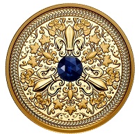
Face value: 200 dollars … Composition: 99.99% pure gold
with genuine grade AAA 0.75 carat rose-cut blue sapphire
EmbellishmentsGems;Mintage: 275; Finish: Proof;
Weight: 31.16g;Diameter: 30 mm; Edge: serrated;
Artist: Hélène Girard (reverse), Susanna Blunt (obverse).
Did You Know? … ***Sapphires come in a variety of colours ranging from violet to orange, and even brown or black. As a type of corundum, sapphire is one of the world’s hardest minerals, second only to diamonds! ***New Brunswick is Canada’s only officially bilingual province, and that’s why its provincial flower (the purple violet) appears alongside Quebec’s provincial flower (the blue flag iris) on this coin’s reverse. ***While the majority of French-Canadians live in Quebec, you’ll find proud Francophone communities all across Canada, with Franco-Ontarians forming the largest community (744,000) outside of Quebec. With approximately 500,000 Acadians in Canada, many reside in the Maritime provinces of New Brunswick, Nova Scotia and Prince Edward Island. *** While there is some debate about the exact origins of the ceinture fléchée, French-Canadian, Indigenous and Métis communities all share the arrow sash as a key cultural symbol. After 1835, sashes produced in Canada primarily came from the region of Assomption, Quebec; known as the Assomption sash, its standard design—herringbone stitching with red, blue and white colours—makes it instantly recognizable.
The reverse design by Canadian artist Hélène Girard features a grade AAA rose cut blue sapphire at its centre, where the gemstone’s blue hue represents Canada’s Francophone spirit … The gemstone is surrounded by an engraved arrangement of repeating ornamental flourishes and emblems associated with French heritage in Canada, including: the fleur-de-lis, a symbol that evokes the wider French-speaking community; the blue flag iris, the floral emblem of Quebec; the purple violet, the floral emblem of New Brunswick; and maple leaves that represent all Francophone communities in Canada. The iconic ceinture fléchée (arrow sash) surrounds the design, embracing all the individual elements as a whole. The obverse features the effigy of Her Majesty Queen Elizabeth II by Susanna Blunt.
Hélène Girard, artist … “As a Francophone artist who is part of Canada’s diversity, I was honoured to work on the design of this coin to celebrate French Canadians. I wanted to incorporate the ceinture fléchée (arrow sash), which is part of our culture’s traditional costumes, and the floral emblems of Quebec and New Brunswick. The delicateness of my subjects, that truly express the beauty of this culture, has helped me realize my goal.”
Cecily Mok, Engraver … “The challenge here was to ensure all the individual elements formed a unified whole. Some of the elements were sculpted with minimal thickness to ensure fluid lines and a smooth transition from one point of interest to another. We also added tiny flourishes to the large fleurs-de-lis, as a way of enhancing the relief when viewed from different angles.”
2022 … Pure Silver Coin –
Colourful Birds: Cedar Waxwing
www.mint.ca
The star of our second Colourful Birds coin, the cedar waxwing has a distinctive appearance thanks to its slicked-back crest, black mask and silky yellow-brown feathers. This gregarious species loves to forage in flocks and can be found in all of Canada’s provinces and territories. It has an appetite for insects and small fruits, including those of the flowering crab apple tree featured in this nature-themed coin design. A beautiful piece that’s sure to brighten up any nature- or bird-themed collection.
Selective colour … Selective colour highlights both the bird and its flowering perch, and transforms the design into a celebration of Mother Nature’s vibrant colour combinations. An immersive scene … The eye-level view pulls you into the scene and creates the impression that you’re standing right next to the bird.
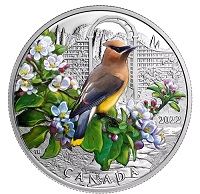
Face value: 20 dollars … Composition: 99.99% pure silver
with selective colour; Mintage: 7,500; Finish: Proof;
Weight: 31.39g; Diameter: 38 mm; Edge: serrated;
Artist: Tony Bianco (reverse), Susanna Blunt (obverse).
Packaging: Black clamshell with black beauty box.
Did You Know? … ***Some cedar waxwings have orange tail tips instead of the usual yellow. This happens when a young waxwing eats a lot of berries from a specific type of honeysuckle and the fruit’s red pigment shifts the colour of the immature tail feathers. ***See the red “drops” on the tips of its feathers? Those are actually waxy secretions on the wing feathers, hence the “waxwing” name (the “cedar” part refers to its love of cedar berries in the winter). It’s not clear what purpose the wax spots serve, but some ornithologists believe they’re related to courtship. ***A lot of fruit in one place can be too much of a good thing for the cedar waxwing! It can become intoxicated after gorging on overripe berries and fruits.
The reverse design by Canadian artist Tony Bianco features an eye-level view of a cedar waxwing (Bombycilla ccedrorum) in an engraved backyard setting, where a stone walkway leads to a lattice arch. In the foreground, the soft pastel colours of the flowering crab apple (genus Malus) tree complement the cedar waxwing’s mix of yellow, brown, grey, white and red feathers. The obverse features the effigy of Her Majesty Queen Elizabeth II by Susanna Blunt.
2022 … Pure Silver Coin – Generations:
The Red River Métis
www.mint.ca
Honouring the “Flower Beadwork People” … These beads come together to form a dazzling floral motif that represents a living tradition for the Red River Métis, known by their neighbours as the “Flower Beadwork People.” The second Generations coin celebrates the tradition of Métis beadwork, which is a proud expression of Métis culture and identity, and an exercise in visual storytelling, as seen on this coin. Today, this centuries-old artform is also a powerful statement of continuity, for each bead contributes to a gorgeous tapestry; and that signature craftsmanship is passed down from one generation to the next, inspiring others to create the patterns that stitch together a people’s past, present and future. Celebrate the everlasting heritage of the Red River Métis.
Coin #2 … The annual Generations series celebrates the transfer of knowledge through the stories of the First Peoples of Canada. The second coin highlights traditional Métis beadwork as a cherished art form and a proud cultural expression; on this coin, the beadwork pattern tells the story of the Red River Métis. Rooted in tradition … With every bead, the story unfolds: by sharing it with others, that story—and the act of its creation—lives on. Métis beadwork is a rich medium for storytelling and for intergenerational learning, and the Generations series of coins honours the artists and storytellers who play a key role in passing down traditional knowledge to new generations. An unforgettable design … On your coin’s reverse, the engraving is done in an elaborate style that perfectly mimics traditional Métis beading. In lieu of colour, varying relief height and frostings help create a striking contrast that sets neighbouring elements apart while adding depth to the overall design. Visual storytelling … This is our first collaboration with Métis artist Jennine Krauchi, whose original beadwork pattern combines several traditional motifs and design elements to tell the story of the Red River Métis.
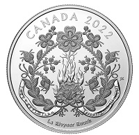
Face value: 20 dollars … Composition: 99.99% pure silver;
Mintage: 5,000; Finish: Proof; Weight: 31.39g;
Diameter: 38 mm; Edge: serrated; Artist:
Jennine Krauchi (reverse), Susanna Blunt (obverse).
Packaging: Black clamshell with black beauty box.
Did You Know? … ***The Métis became known for their beadwork in the 19th century, when their decorative beadwork patterns earned them the moniker “the Flower Beadwork People.” Inspired by what they had seen in nature and intertwined with French embroidery designs, the Métis women created their own style of beadwork. The five-petalled prairie rose is the most common Métis beading motif, while curves, stems or tendrils are typically used to connect every element within a beadwork pattern. Another classic motif is the feathered stem (as seen on this coin), which is marked by bead accents or “mouse tracks” that run down its sides. Métis beaders are also known to intentionally include a mistake—a miscoloured or misplaced bead or “spirit bead”—in their work to protect them from vanity, since only the Creator can create something perfect.
Your coin’s reverse features an engraved rendering of an original floral beadwork pattern by Métis artist Jennine Krauchi, who has weaved together traditional beading elements to tell the story of the Red River Métis. At the base of the design, roots are intertwined with the Red River (“ LA RIVYEER ROOZH” in Michif) to represent the Red River Métis homeland and ancestry, while the infinity symbol speaks to the Red River Métis’ eternal and unbreakable spirit. Placed within the river are the Michif words “TAAPWEEYIMISHO” and “TAAPWEEYIMIK LII MICHIF”, which mean, “Believe in yourself” and “Believe in (the) Métis”. The central portion of the design speaks to a period of repression and loss, but the prairie rose—a classic Métis motif—represents the survival of the Red River Métis and a cultural resurgence. Long stems adorned with “mouse tracks,” leaves and flower buds fill the pattern with a sense of love and joy. The obverse features the effigy of Her Majesty Queen Elizabeth II by Susanna Blunt.
JENNINE KRAUCHI, ARTIST … I have always tried to tell a story through my beadwork, whether it’s a personal story or a broader theme. For this coin, I tried to tell a little of the history of the Red River Métis, our struggles and hardships and what we have overcome as a people. I never thought that my journey of Métis beadwork would result in having my design chosen to be featured on a coin. I am so very proud, humbled and honoured. I created this image in celebration of all my Métis ancestors and all of the beaders who came before me, right back to those who picked up the first bead and produced this beautiful artform.
MATTHEW PORTER, SCULPTOR/ENGRAVER/3D GRAPHICS … I feel so proud and honoured to have worked on this coin, and it’s such a unique piece because of all the individual bead components that form the design. In terms of the engraving, the biggest challenge was achieving the right contrast: I used multiple frostings and varying relief height to change the way the light reacts with the different design elements, and that’s what delivers the ‘wow’ factor.
OLIVER BOULETTE, MÉTIS ELDER … Jennine is one of those gifted knowledge keepers who passes on her stories through her beading to future generations about the roots of the Métis, Jennine’s amazing depiction of Métis history, culture, and way of life emerge quickly in this design. It outlines the struggles, language, clothing, food, traditions and more. It is easy to see that Jennine has poured her heart, her soul, and love into this work. This is a masterpiece that captures so much within a limited space. I have seen nothing like it.
![]()
www.gtapa.org
The GTAPA is committed to promote and stimulate
the art of philately to all ages for fun,
culture, education, and friendship.